Making access to vaccine records and booking more convenient for Ontario users
Background
COVID Alert was developed by the Government of Canada to inform users of possible exposures to COVID-19 and to help limit the spread of the virus. COVID Alert is currently a separate tool, in addition to the multiple COVID-19 systems available for vaccine booking and retrieving vaccination records. With the disparate systems, I saw an opportunity to integrate existing tools to help improve efficiencies for Ontario users.
Challenge
Ontarians currently find it inconvenient and time consuming to access their COVID-19 vaccine records and schedule their vaccine appointments through the current provincial systems.
“How might we make access to COVID-19 tools easier for Ontarians?”
Solution
I added a new feature to COVID Alert to allow users retrieve their vaccine certificates and book appointments. The intended outcome of the all-in-one COVID response tool is to help users save time from logging in to multiple systems, minimize confusion in navigating through different processes, increase vaccination rates in Ontario, and drive usage of COVID Alert.

Since COVID Alert is a nationwide application, I placed a strong emphasis on privacy and accessibility when designing the solution, ensuring that Web Content Accessibility Guidelines (WCAG), Accessibility for Ontarians with Disability Act (AODA), and Personal Health Information Protection Act (PHIPA) requirements are met.
Success Metrics
Application downloads
Active users
Registered users
Vaccine appointments scheduled
Booking time between web vs. mobile
Time to retrieve vaccine certificate
Process Overview
I used the design thinking framework to validate my hypothesis by first understanding the problem domain using an exploratory approach. Below are the 6 phases guiding my end to end design process.
Goals
  • Understand the problem space and the COVID-19 situation in Ontario
  • Assess similar mobile applications from other countries to identify common patterns, opportunities, and challenges
      22%
      88%
      20%
      Unvaccinated Toronto residents do not know how to book a vaccine appointment
      Canadians own a smartphone device
      Eligible Ontarians have not been fully vaccinated
      Majority of contact tracing applications use Bluetooth technology and offer more than 2 language options. Some countries such as Germany and Italy have implemented the ability to access vaccine certificates and COVID test certificates through their app. However, no contact tracing apps currently offer the ability to directly book vaccine appointments.
      Research - Understanding the user experience
      User Interview Insights
      Objective
      Understand user's motivations, goals, needs and pain points when navigating through COVID Alert and the provincial booking system
      Participants
      8 participants between ages 20 – 53 who have used COVID Alert, or booked their vaccination appointment in Ontario
      "Different hospitals and regions had their own systems. Appointments booked on a regional site was not reflected in the provincial one"
      "When I was looking for which community center/pharmacy had the vaccine I wanted, I had to go through each individual website. I wish it was all on one place"
      "It was annoying to re-enter my information because my health card isn’t just in my hand all the time. I entered the number so many times to the point where I had memorized it"
      "I have my vaccine certificate saved on my phone, but I have to go through a few steps to get there. I’ve taken a screenshot too, but I am worried it would get buried in my photos"
      Synthesizing research findings
      Using data gathered from the user interviews, I created an affinity map to identify common themes and pain points
        Common Pain points
        • Multiple systems and processes to book vaccine appointments (i.e. provincial website, regional websites, hospital websites, contacting pharmacies/clinics)
        • Constant re-entering of personal information to login
        • Inconvenience in the current process when retrieving vaccine certificates
        Understanding the common pain points helped to validate the problem and identify what users value most when booking their vaccine appointments/ accessing their vaccine certificates
        Research - Prioritizing user pain points
        User Survey Insights
        Objective
        To understand how users prioritize potential features and pain points gathered from user interviews to determine the focus of the solution
        Participants
        20 participants between ages 18 – 68 who live in Ontario
        Key TAKEAWAYS
        Participants rated the following features from highest to lowest priority
        • Ability to access vaccine certificate
        • Ability to book vaccine appointment/ access appointment details
        • Ability to view the latest COVID-19 updates and rules
        • Ability to use COVID Alert without Bluetooth
        • More language options (i.e. chinese, punjabi)
        • Compatibility with older phones
        Is this problem worth solving?
        Yes - all participants expressed inconvenience in either retrieving their vaccine certificate or booking their vaccine appointments due to the multiple systems and processes currently in place.
        Defining the target customer
        User Personas
        I developed 3 personas based on insights from my user interviews - each serving people with varying goals, preferences and needs. I decided to focus on Jennifer as her goals and needs were most common among participants interviewed.

        Developing personas allowed me to step into the user’s shoes to understand their needs and expectations, and guide the ideation process to design a solution that supports the user's behaviour.
        Understanding the customer journey
        User Journey Mapping
        I developed 3 personas based on insights from my user interviews - each serving people with varying goals, preferences and needs. I decided to focus on Jennifer as her goals and needs were most common among participants interviewed.

        Creating a journey map for my target persona helped me identify frustrations and opportunities during specific parts of the customer journey and think about ways to reduce the number of actions, time spent, and number of platforms used from beginning to end.
        View User Journey Map
        Reframing research insights into opportunity areas
        'How Might We' Statements
        • How might we create a process to help users spend less time retrieving their vaccine certificate?
        • How might we create a process to help users spend less time booking their vaccine appointment?
        • How might we make it easy for users to search for a vaccination location with their vaccine preference?
        • How might we help users easily book appointments for friends and family members?
        • How might we create a central location for users to book their vaccine appointments?
        The solution
        Using the 'How Might We' statements above, I arrived at the concept of an all-in-one COVID-19 response tool, with the ability to easily book vaccine appointments and access vaccine certificates.
        Defining the product roadmap
        Product Requirements
        Based on the research insights, and a strong understanding of the user and business goals, I developed a set of product requirements to guide the ideation phase.

        The product requirements were then prioritized to determine the features to include in the first iteration of the MVP.
        Aligning product and market fit
        Value Proposition Canvas
        From the affinity map, I created a value proposition canvas to visualize the product value for users. Understanding the product features and user needs helped ensure that there is a direct alignment between user needs and what the product offers
        Ensuring new feature integrates seamlessly with existing navigation
        Site Map
        Since I was adding a feature to an existing application, I used the existing navigation flow in the app to maintain consistency in the design.

        I developed a site map that displays the hierarchical structure of new and existing content to visualize how the new feature integrates with the existing navigation
        Understanding how users will be interacting with the app
        User Flow
        With the site map in mind, I created a user flow to map out Jennifer's journey and decision points as she navigates through the app.

        The user flow highlights various scenarios of a user accessing vaccine booking services and their vaccine certificate.

        Understanding how target users will interact with the app helped me determine the product requirements needed to perform key tasks.
        Building low fidelity wireframes
        Exploring Options
        Based on the product requirements, I analyzed design patterns of several appointment booking mobile applications and existing digital vaccine passports and noted features that were functional and intuitive. From there, I created some early sketches of the new feature.

        Using my sketches, I developed low fidelity wireframes for the following key tasks: (1) Account Creation, (2) Login, (3) Appointment Booking, (4) View Vaccine Certificate, (5) Add New member. I focused on ensuring that the existing flow is maintained from the current booking website to create a familiar experience and reduce the cognitive load for users.
        Early testing with low-fidelity wireframes
        Usability testing with low-fidelity wireframes
        With low-fidelity wireframes ready, I conducted an early round of usability testing in order to gather feedback from users and identify pain points early on. 5 users navigated through the low fidelity prototype via moderated tasks and overall, responded positively to the concept and design
        "It’s such a common scenario now to have to pull up your vaccine certificate. It’s nice to be able to do that easily with this app. I love how simple it is"
        "It’s all intuitive, which is the best thing because users don’t need any help going through the app. They can navigate on their own with little to no prompting"
        Key PAIN POINTS IDENTIFIED
        • Challenges navigating to vaccine certificate from the menu as users were unsure if an account/login was required for access
        • Considerations for privacy & consent when booking appointments for others and collecting personal health information
        • Lack of indication for non-editable fields on account information screen
        • Users were unfamiliar with where the ‘Show ID’ button would navigate to
        • The appointment booking screens appear too crowded with the change profile selection at the top of the screen, and some users were confused by the profile selection screen
        Iteration based on user feedback
        High fidelity prototype
        Based on the early feedback, I iterated on the wireframes and developed a high fidelity prototype for a second round of user testing to obtain further feedback.
        KEY CHANGES MADE
        • Added a description below the COVID-19 Vaccinations heading to provide user context for the Login and Account navigations
        • Added a consent checkbox on Add New Member screen to ensure users obtain consent prior to booking vaccine appointment for others
        • Greyed out inactive fields in the Personal Information screen to indicate fields that are not editable
        • Renamed the 'Show ID' button and added a description to provide users context for where the button will take them
        • Incorporated profile selection to Account page for a cleaner layout
        Usability Testing with high fidelity prototype
        Usability testing with high fidelity prototype
        5 users navigated through the high fidelity prototype via moderated tasks. Overall, users found it valuable to have all COVID-19 related items in one place and found the app easy and intuitive to use. Users appreciated the convenience of saving time booking their appointments, retrieving their vaccine certificate, and keeping track of their appointment dates.
        "It’s nice to have everything consolidated in one place. I would definitely use this app. It’s like a central hub for all COVID-19 related things which is great"
        "I like how I can just add scheduled appointments to my calendar and set a reminder for myself, since I always have to do that manually"
        "If this app was available, I would prefer it over the current tedious process"
        Key PAIN POINTS IDENTIFIED
        • Vaccination section in the menu blends in with the rest of the menu content
        • Lack of ability to filter location results
        • Lack of ability to add vaccine certificate to Apple Wallet (for phones that don't have access to the internet)
        • Health card number is not always required when booking vaccine appointments for others
        • Users felt that having the profile selection within the vaccine booking flow was more intuitive
        Priority Revisions
        Shifted COVID-19 Vaccination Section to the top of the menu to increase visibility
        "My first instinct is to look at the top of the menu. It’s easy to miss the vaccination section because it blends in with the rest of the content"
        Added filter option to allow users to narrow locations by organization type and open hours
        "It would be helpful to be able to filter, especially if there’s a long list of locations to choose from"
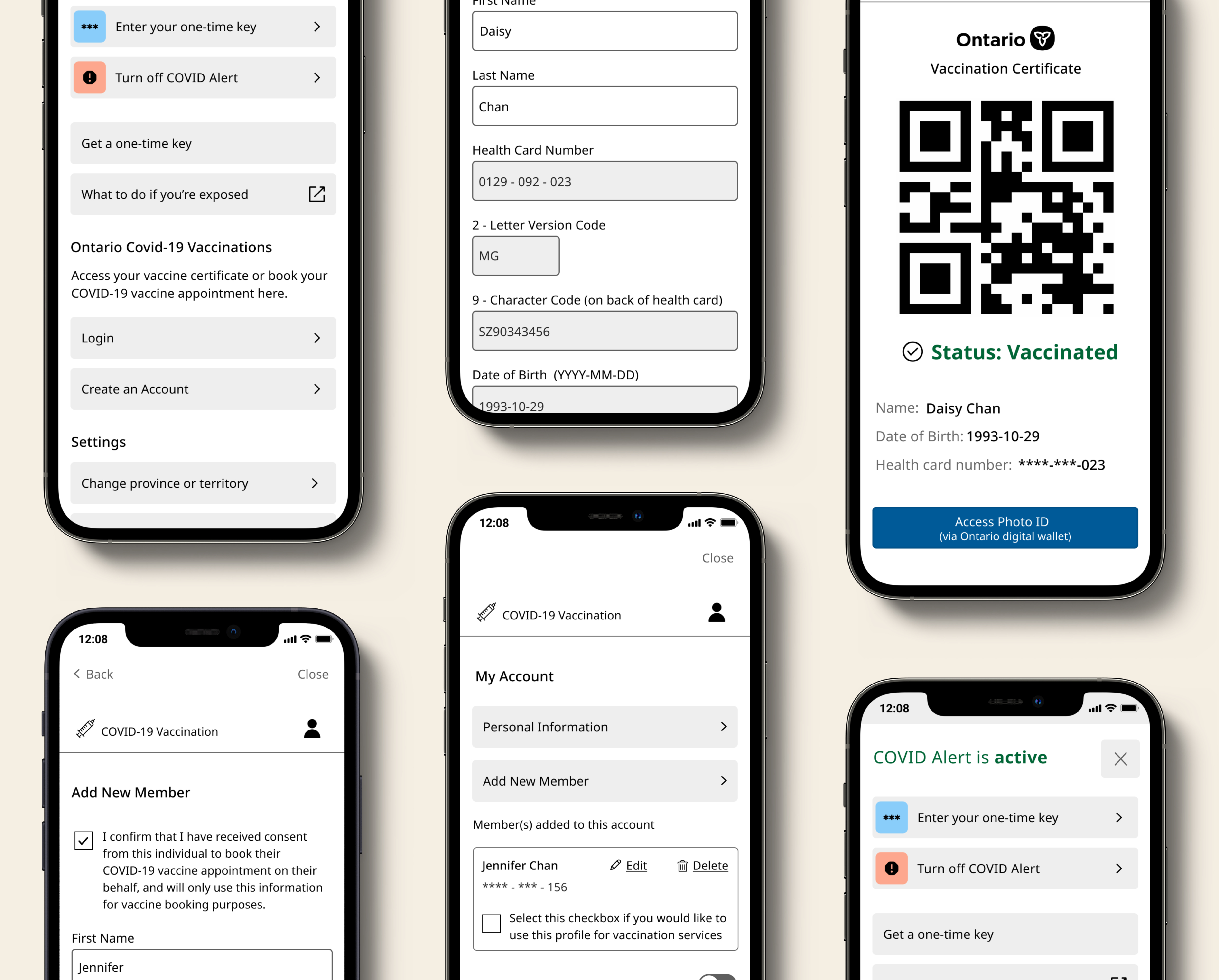
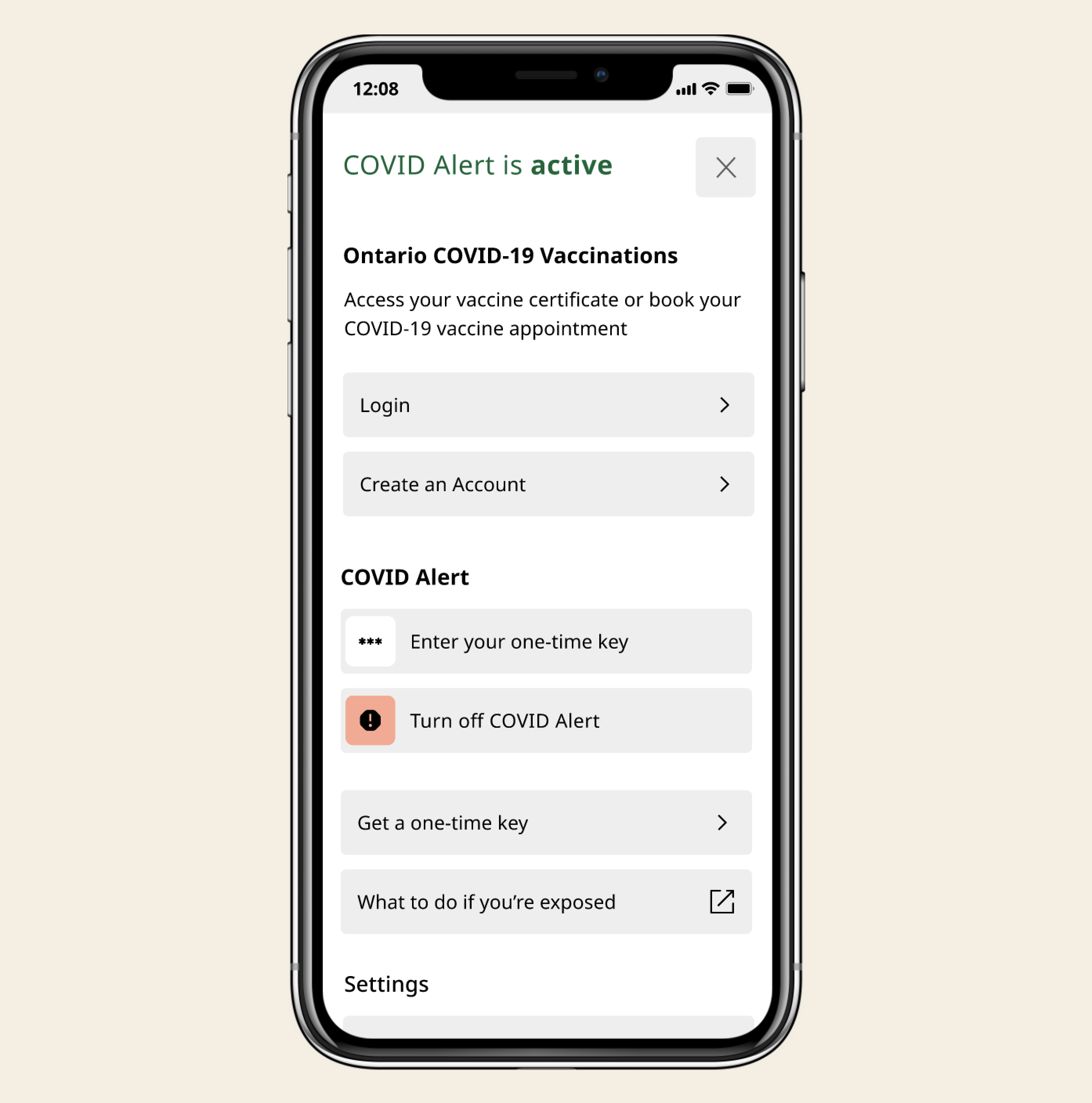
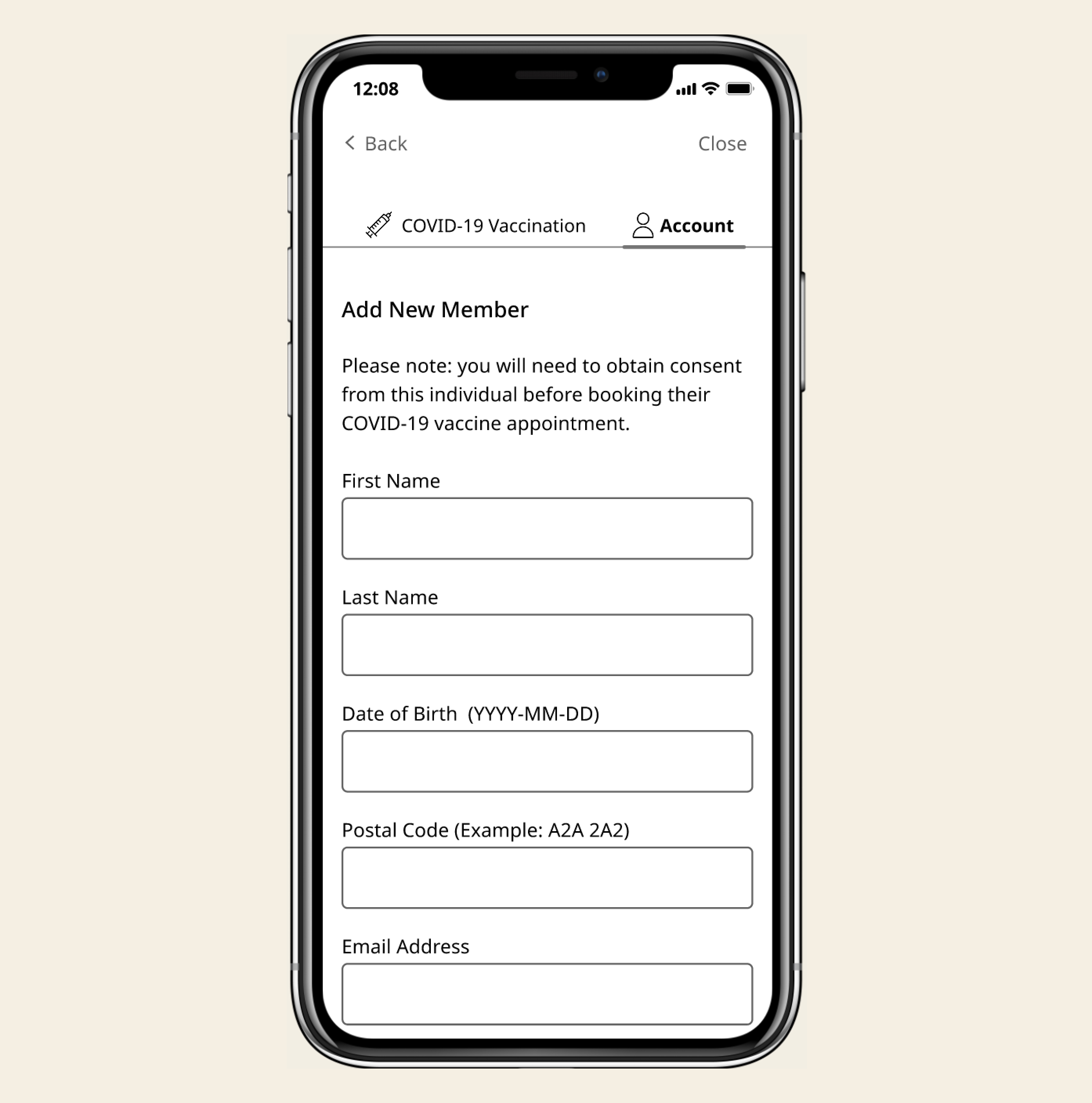
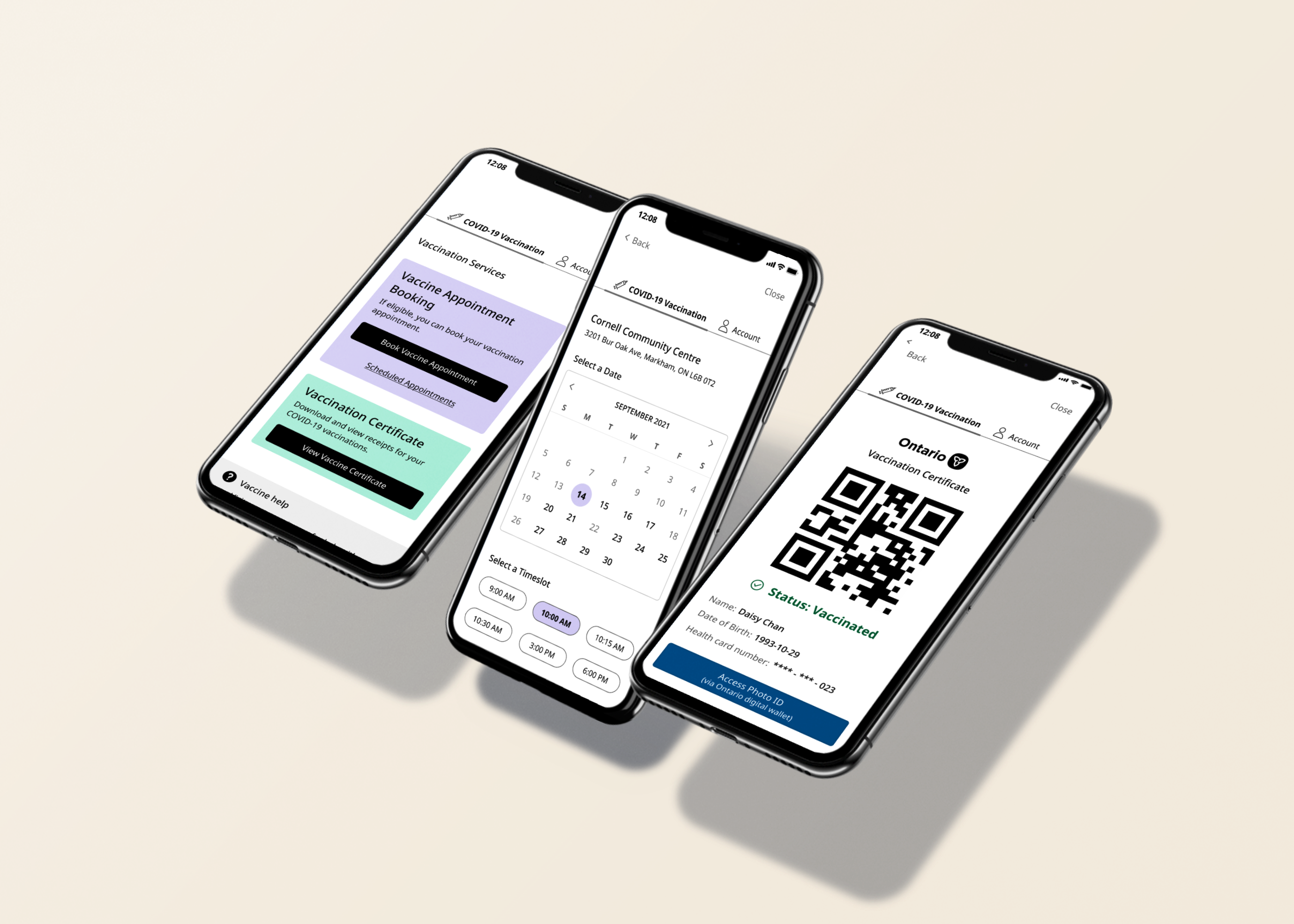
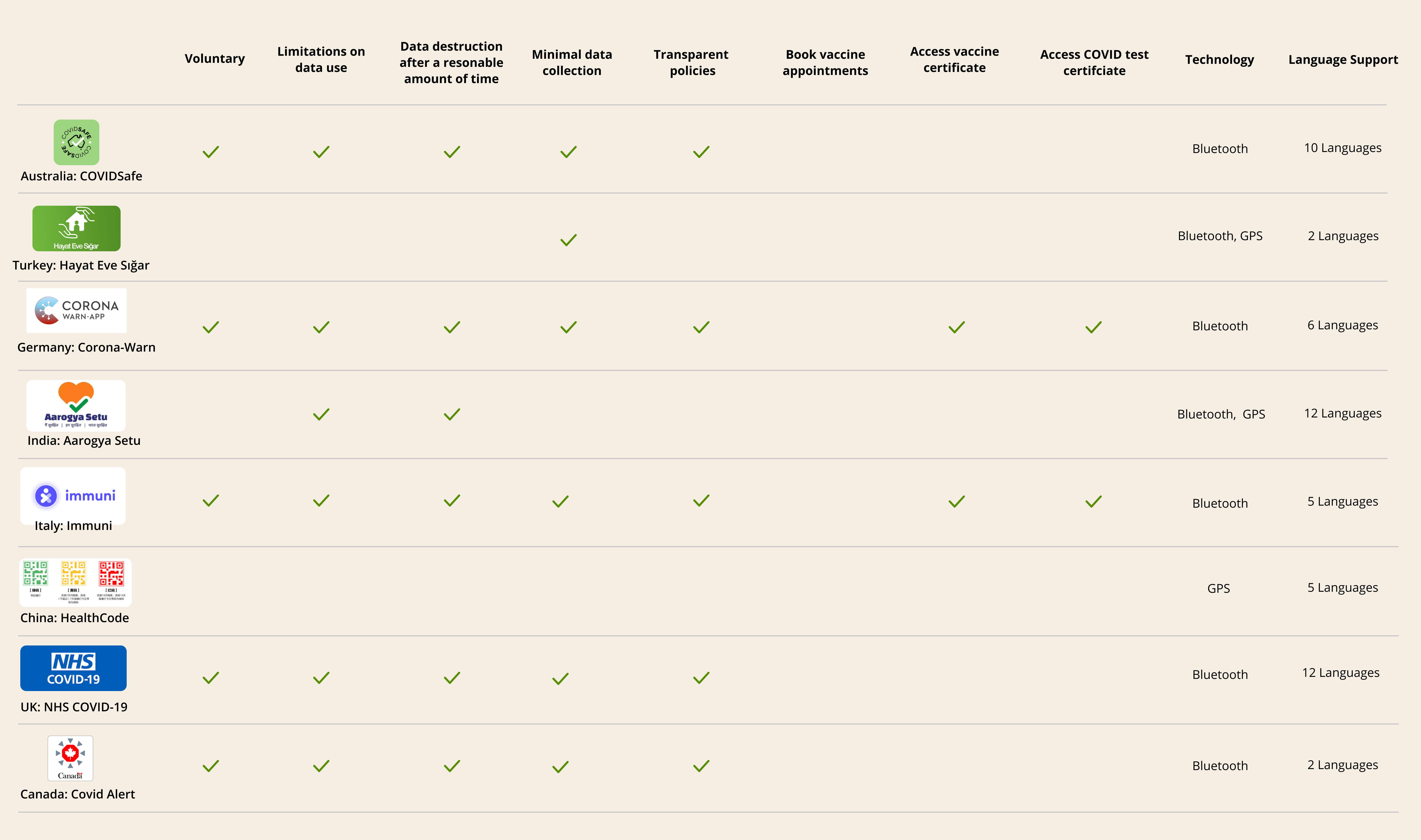
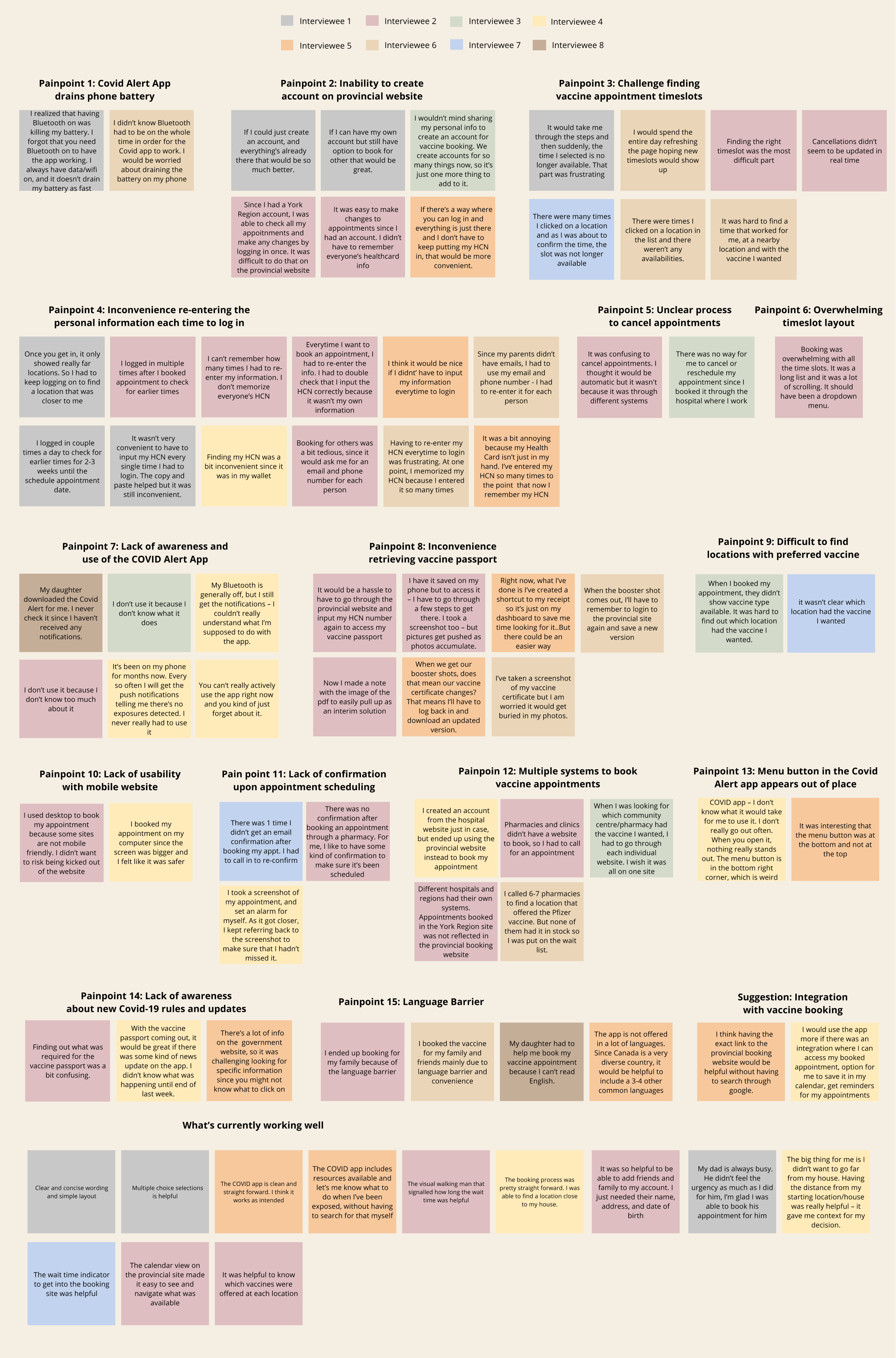
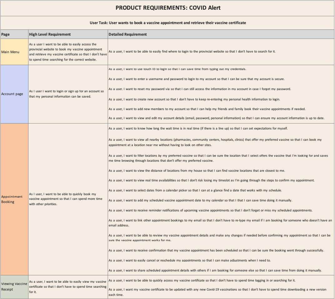
        Removed collection of health card number when adding new member to user's Account to minimize data collection
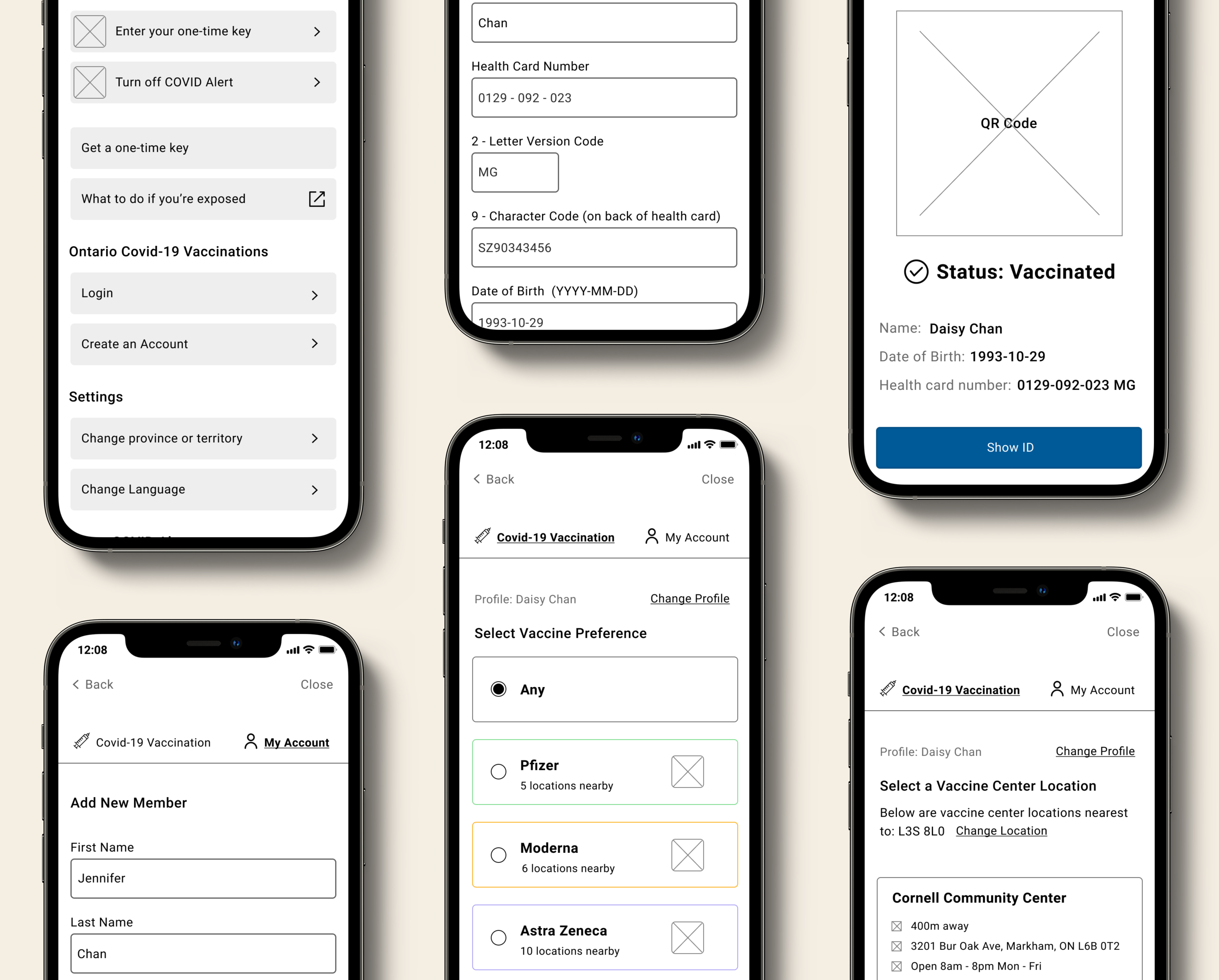
        "When I booked appointments for my family through the regional system, all they asked for was the Name, Date of Birth, Phone Number, and Email. Health card was not required"
        Incorporated the ability to add vaccine certificate to Apple Wallet to allow users to access without internet
        "My parent’s phones don’t have data, so being able to save it on their phone or Apple Wallet would be useful for them"
        Incorporated profile selection within the appointment booking flow
        "It's more intuitive for me to select who I want to book an appointment for within the flow rather than going to the Accounts page"
        Final Prototype
        View Prototype
        Lessons Learned
        Keeping an open mind
        Although I had an initial feature in mind prior to starting this project, I kept an open mind in order to validate my hypothesis and determine a solution that would address user's biggest pain points. Through my user research, it was evident that there was a real need for an all-in-one COVID response tool.
          Testing early and often
          Testing my low-fidelity wireframes early helped me gather user feedback and identify pain points before committing to a high fidelity design.
            Considering the design system
            Since I was adding a feature to an existing application, it was important to consider the product's existing design system and interaction patterns early in the project so that the new feature integrates seamlessly with the product.
              Back to Top

              Explore Other Projects