Providing a convenient way to manage your pet's essential needs
ROLE
TIMELINE
Lead UX/UI Designer
4 weeks
SCOPE
TOOLS
Research, Information Architecture, Visual Design, Branding, Interaction Design, Testing
Figma, Whimsical, Miro
OVERVIEW
Pet information at your finger tips
The Challenge
Pets bring joy and companionship into our lives and are oftentimes considered members of the family. However, keeping track of pet's medical records and ensuring they maintain a healthy diet and lifestyle can be challenging for pet owners, especially on top of managing their own responsibilities.
“How might we make managing and caring for pets easier for pet owners?”
Solution
I created a light-hearted and fun mobile app where pet owners are guided by pets through the process of tracking medical records, reminders, and accessing pet care resources. I chose this approach to create a strong emotional connection with pet owners, while enhancing trust and transparency through consistent design and clear instructions.
Success Metrics
Application downloads
Active users
Registered users
Time to retrieve pet health information
Time to set appointment reminders
Time to research for pet care resources
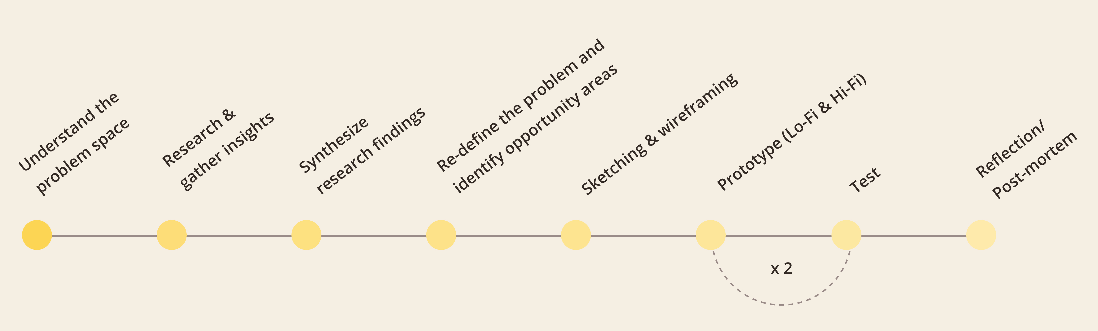
Process Overview
I used the design thinking framework to validate my hypothesis by first understanding the problem domain using an exploratory approach. Below are the 6 phases guiding my end to end design process.
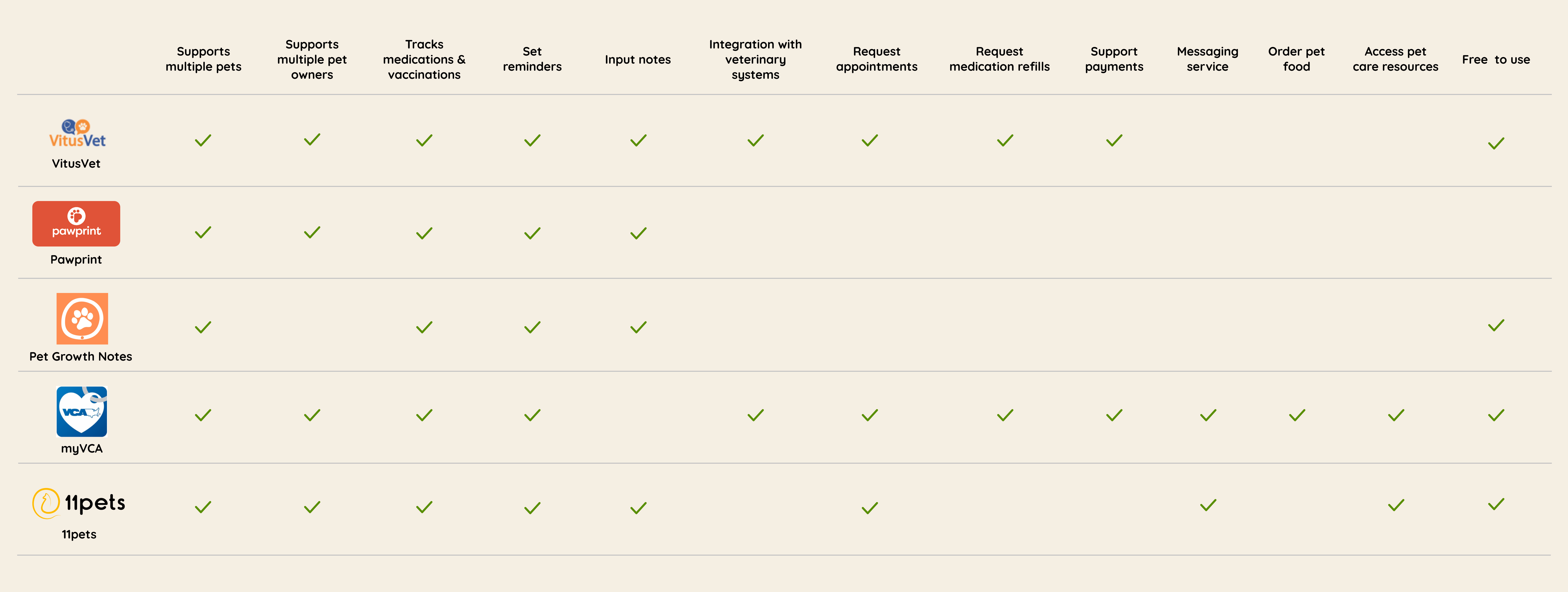
Not all pet care apps available are free to use. Those that are free often include advertisements or cluttered interfaces that deter pet owners from using the apps.
Few mobile apps are integrated with veterinary systems allowing the ability to request appointments, medication refills and pay for pet care services. However, these apps are currently only available through select veterinary clinics
Research - Understanding the user experience
User Interview Insights
Objective
Understand pet owner's motivations, goals, needs and pain points when caring for their pets
Participants
6 participants between ages 25 – 33 who own either a dog or a cat and have visited a vet before
"We can make guesses about what’s wrong with humans but with pets, we don’t have that knowledge"
"I had a piece of paper and for the longest time, we couldn’t find it. I wasn’t sure what vaccines my cat received and what she needed"
"Our dogs are on different timelines – they are years a part so it’s hard to keep track of their vaccination schedules"
"The current app I use is extremely manual. There is virtually no intelligence whatsoever. It is also filled with a lot of ads since it was free, which was really annoying. I don’t use it unless I really need to"
Affinity Map
Using data gathered from the user interviews, I created an affinity map to identify common themes and pain points.
Common Pain points
Lack of knowledge on how to best care for pets. Common areas included pet’s behaviours, feeding, training, medication, and exercise
Challenges maintaining pet's medical records
Challenges remembering pet's appointments - many rely on their vets to send them reminders
Understanding common pain points helped to validate the problem and identify what users value most when it comes to managing their pets.
DEFINE
Synthesizing research findings
Aligning product and market fit
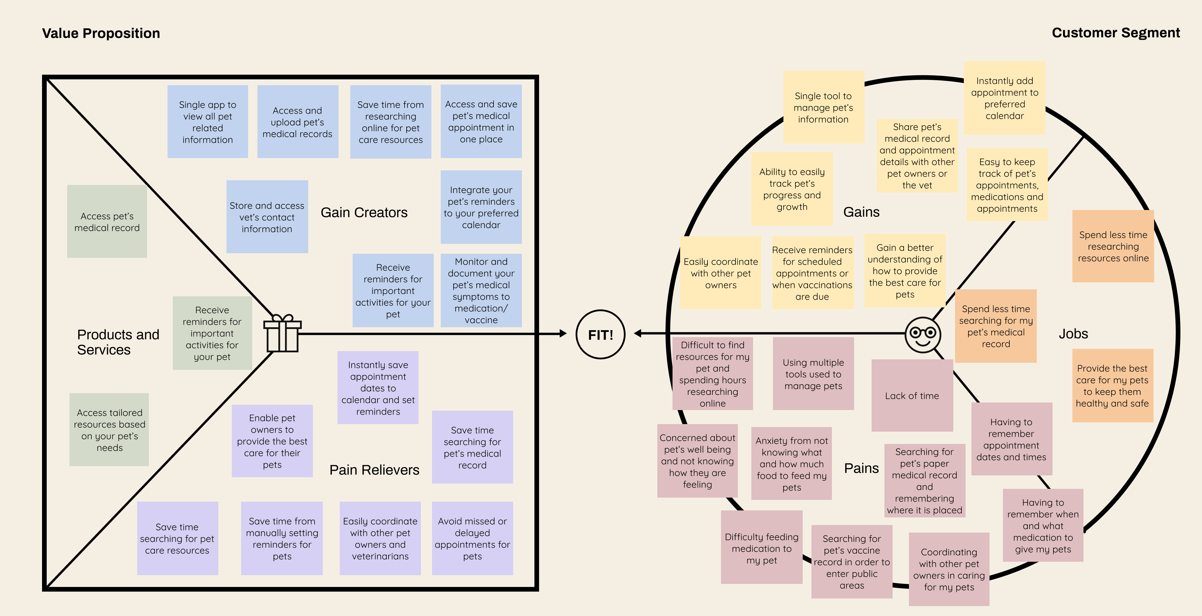
Value Proposition Canvas
From the affinity map, I created a value proposition canvas to ensure that the user needs correspond to what the product offers.
Defining the target customer
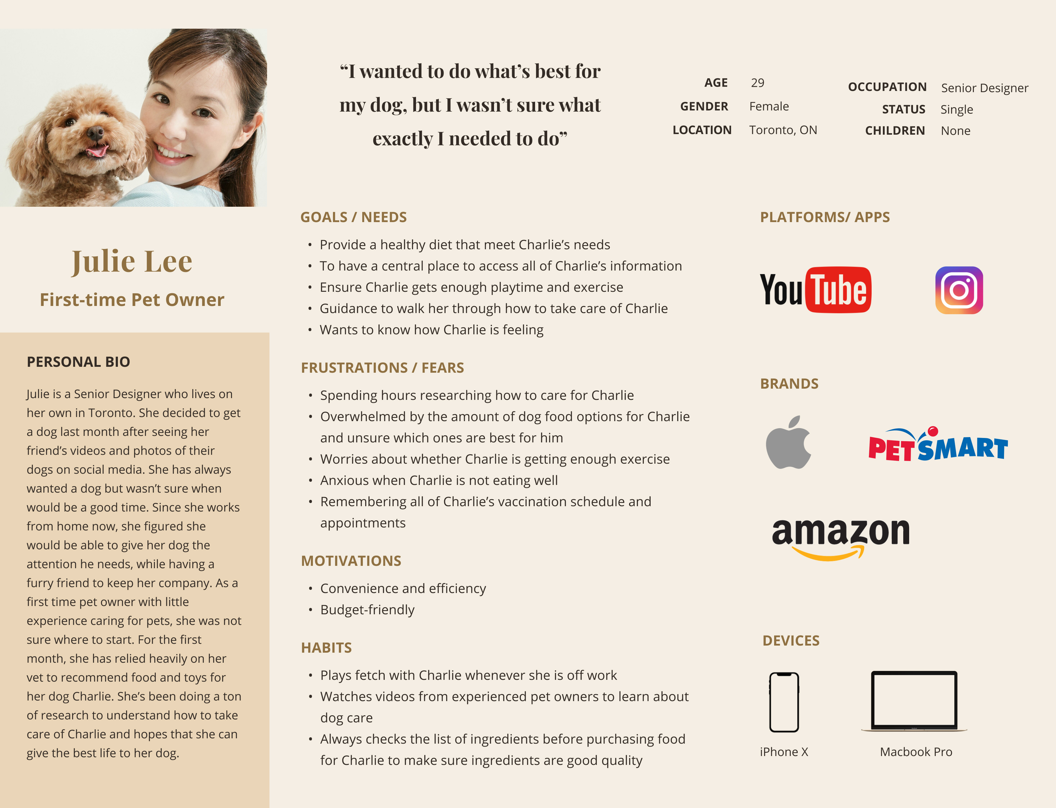
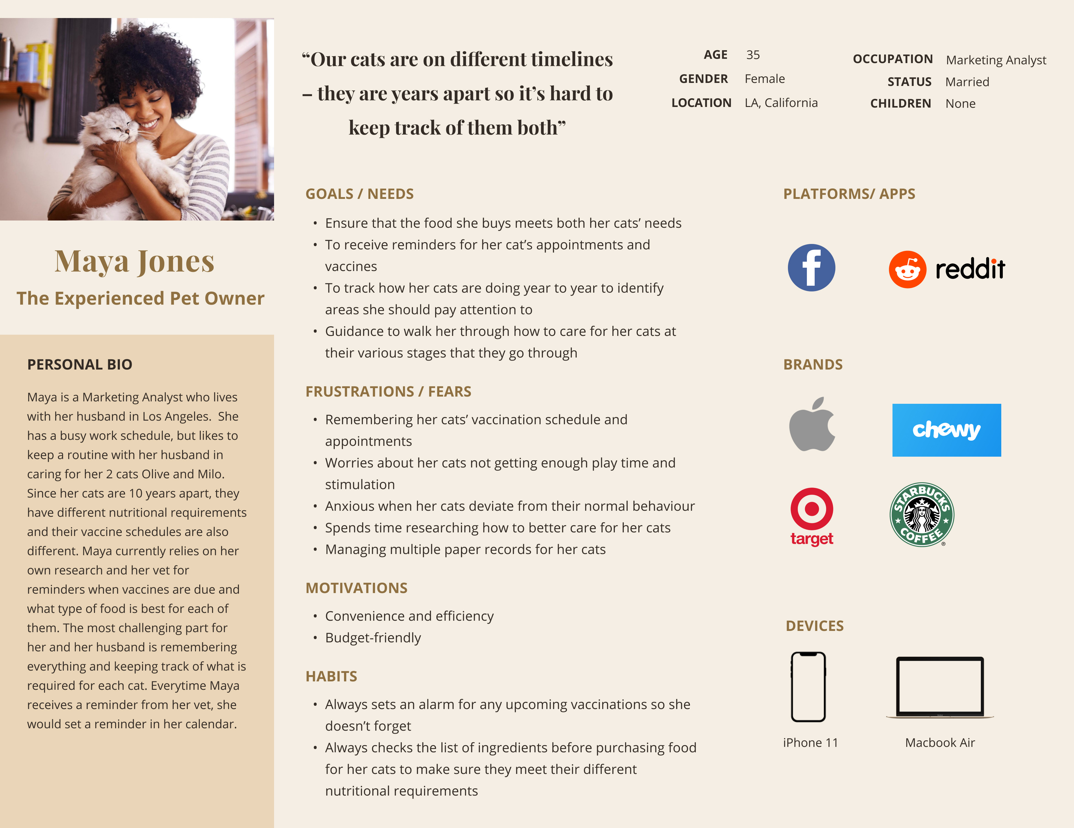
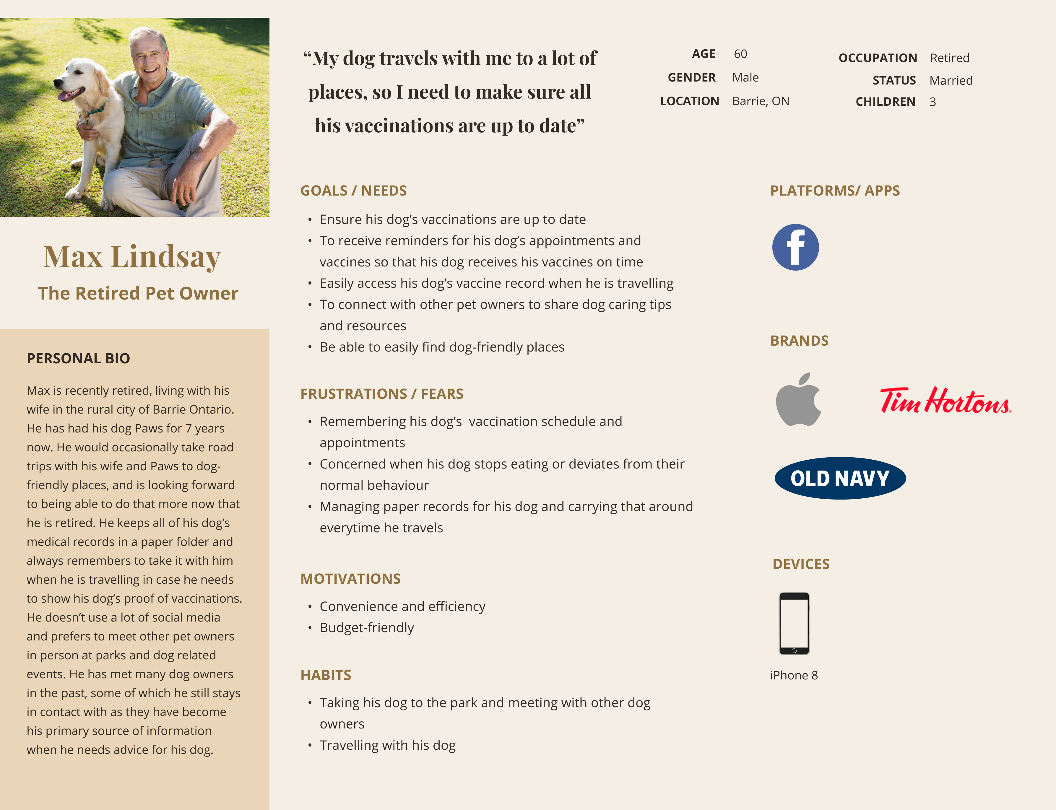
User Personas
I developed 3 personas based on insights from my research - each serving people with varying goals, preferences and needs.
It was evident through the research insights that there were many common pain points between first time pet owners and experienced pet owners. I decided to focus on Julie to address the additional needs of first time pet owners.
Developing these personas allowed me to step into the user’s shoes to understand their needs and expectations, and guide the ideation process to design a solution that supports the user's behaviour.
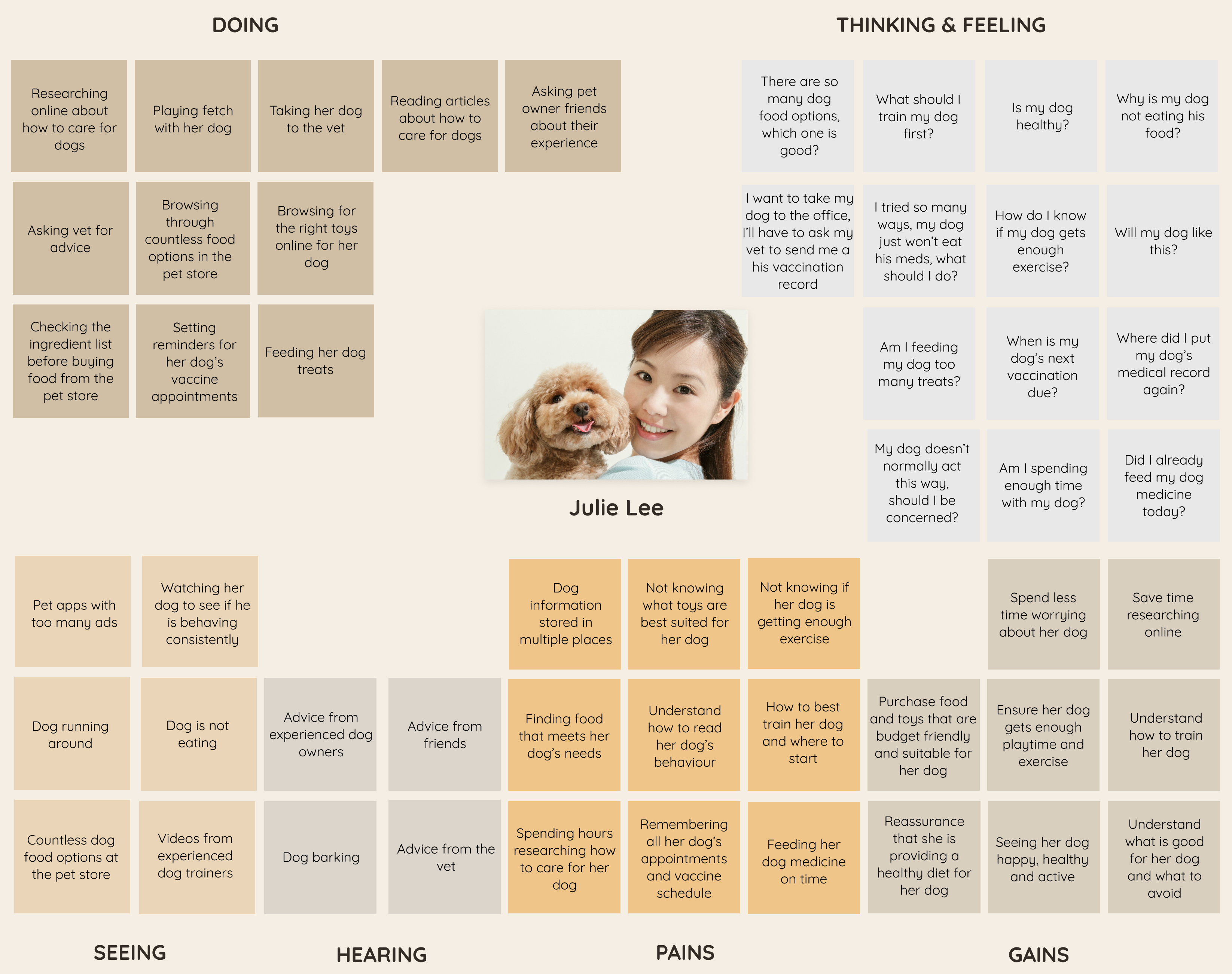
Gaining a deeper understanding
Empathy Map
Since I am personally not a pet owner, I felt it was important to create an empathy map based on the research insights to gain a deeper understanding of the user’s feelings, attitudes and behaviours towards managing their pets, and better understand the broader influences in pet owner's lives
Re-defining the problem
Although all pet owners expressed challenges keeping track of their pet's medical records and appointments, pet owners also expressed the lack of knowledge on how to best care for their pets and the abundance of resources that they have to sift through.
With the research insights, I re-defined the problem. I decided to focus on creating a mobile app that not only helps pet owners manage their pet's medical records, but also provide them access to relevant pet care information to help pet owners save time researching - a common pain point identified through the user interviews.
Reframing research insights into opportunity areas
'How Might We' Statements
How might we create a process to help pet owners spend less time researching for pet care resources?
How might we make it easier for pet owners to keep track of their pet's medical records?
How might we make it easier for pet owners to remember their pet's appointments?
How might we make it easier for pet owners to remember their pet's medications and regimen?
How might we enable pet owners to spend less time worrying about their pet's health?
The solution
Using the 'How Might We' statements above, I arrived at the concept of Pet Aid app, which enables pet owners to track their pet's medical records, set important reminders, and access tailored resources and tips to better care for their pets.
Defining the product roadmap
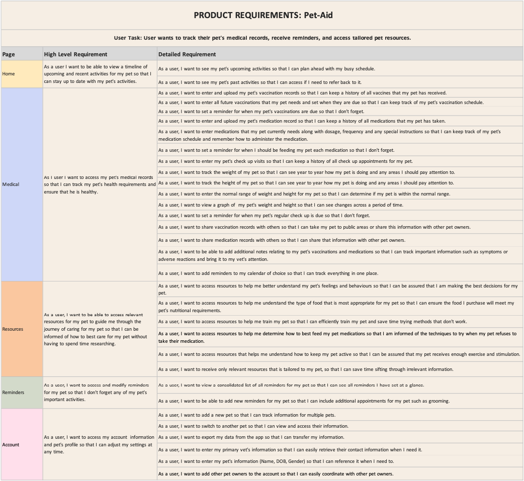
Product Requirements
Based on a strong understanding of the user's needs, I developed a set of product requirements to guide the ideation phase.
I used a priority matrix to determine which features were critical for meeting both users and business needs given the resource and time constraints.
Defining the foundations of the app
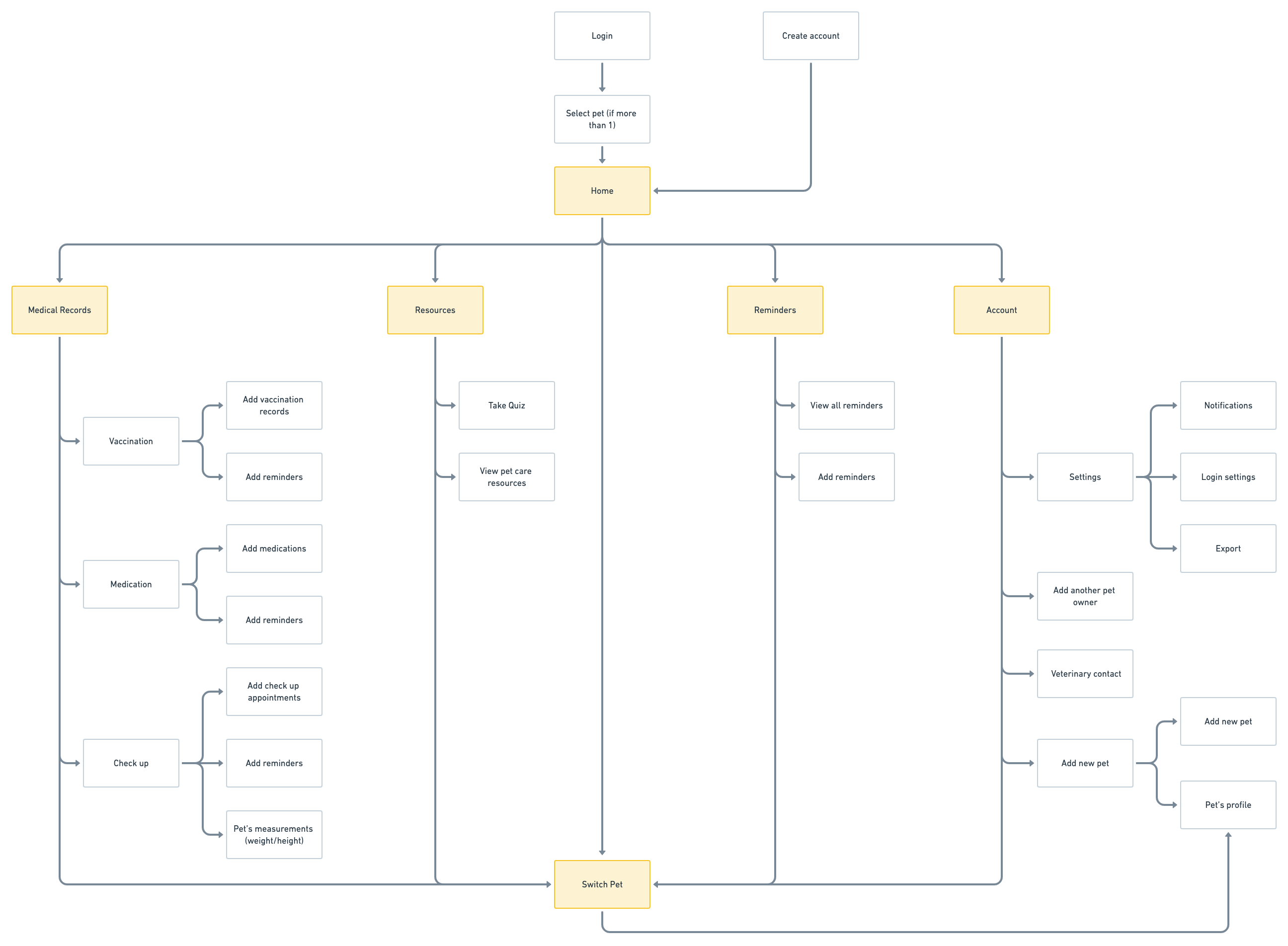
Site Map
Through the user research, it was clear that medical records, resources, and reminders were common pain points that pet owner's struggled with. Hence, I decided to use 5 prominent navigations to allow users to easily access these important features: Home, Medical Records, Resources, Reminders, Account.
Understanding how users navigate through the app
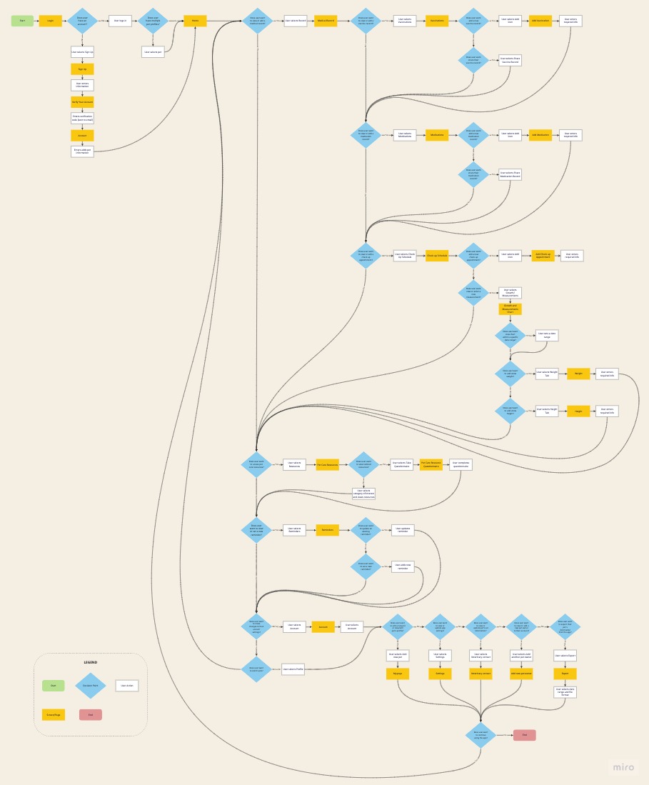
User Flows
With the site map in mind, I created a user flow to map out Julie's journey and decision points as she navigates through the app.
Evaluating all possible scenarios and understanding how target users will interact with the app helped me determine the product requirements needed for users to perform key tasks within the app that will address their pain points.
IDEATE
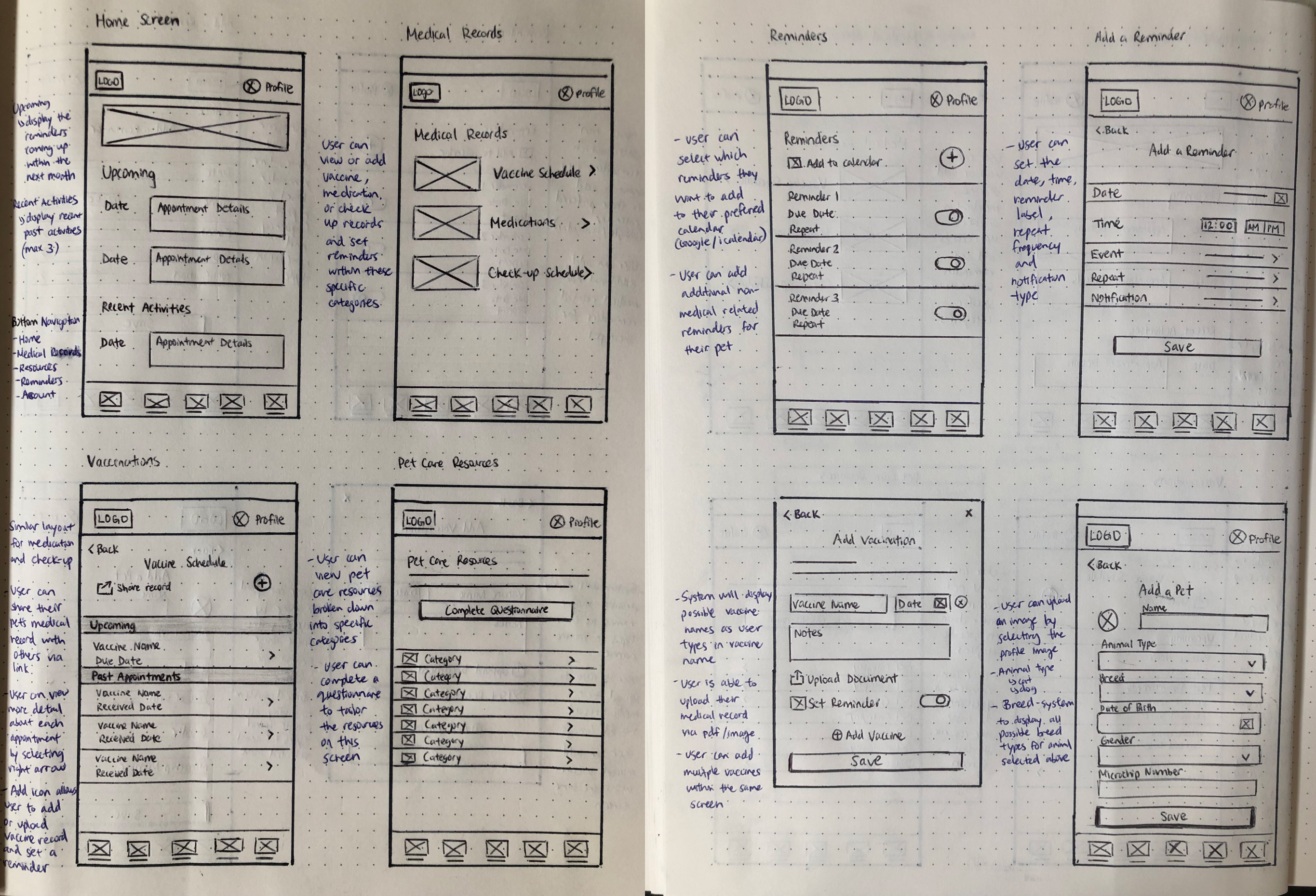
Building low fidelity wireframes
Exploring Options
Based on the product requirements, I created some early sketches of the mobile app. I focused on ensuring that the home page revolves around the pet's appointments/medical records. I used 5 prominent navigations to allow uses to easily find what they need
PROTOTYPE & TEST
Wireframe prototype and testing
Low-fidelity Wireframe - Usability Testing
With low-fidelity wireframes ready, I conducted an early round of usability testing in order to gather feedback from users and identify pain points early on. 3 users navigated through the low fidelity prototype via moderated tasks and overall, responded positively to the concept and design
"I love this app idea. Overall, it’s a really nice layout and I like how the information is presented"
"I love how the pet care resource questionnaire was short and concise, it didn’t take a lot of my time which is great"
Key PAIN POINTS IDENTIFIED
Users felt that pet care resources should be more accessible on the home screen
Difficulty navigating to medical record screen due to unclear wording
Users preferred to be able to upload and add a medication/vaccine from a single screen
It was not immediately clear to users the purpose of each screen. Additional description was needed to provide context to guide users
Developing brand identity
Logo Design
Since pets play a huge part in pet owner's live, I wanted Pet-Aid's brand message to convey the warm, positive, and playful aspect that pet's bring to our lives.
UI Kit
A vibrant yellow tone was selected as the primary brand colour to bring a sense of cheerfulness and positivity. I selected pink, blue and brown as accent colours to convey compassion, warmth, trust and reliability with the app.
Simple illustrations of pets were used to guide pet owners through each step, which adds to the playfulness and approachable brand message. Quicksand was selected as the primary font type to reflect the fun and friendly tone of the brand. Quicksand is also a highly readable typeface, which makes it accessible for mobile interfaces.
TEST & ITERATE
Usability Testing
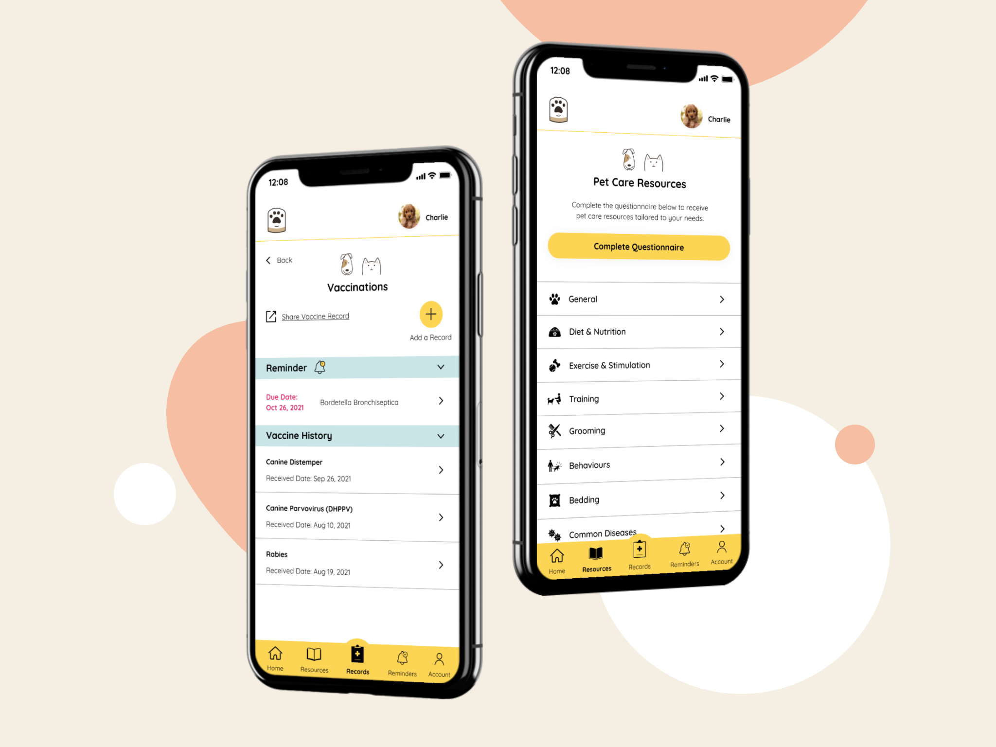
High Fidelity Prototype
3 users navigated through the high fidelity prototype via moderated tasks. Overall, users found it valuable to have a single place to store and track their pet’s information. All users found the app easy and intuitive to use. Users value the convenience of not having to manually set reminders, search for their pet’s medical records, research online for resources, and keep track of their pet’s appointment dates.
"The app is very seamless and very easy to navigate. I would be able to navigate this app on my own without any guidance"
"Right now, I have to go in my calendar to manually add in appointments. To be able to automate that process and have the app pre-populate the appointment details for you is amazing"
"Having tailored resources is super helpful, especially when you’re a new pet owner and you just don't know where to start"
Key PAIN POINTS IDENTIFIED
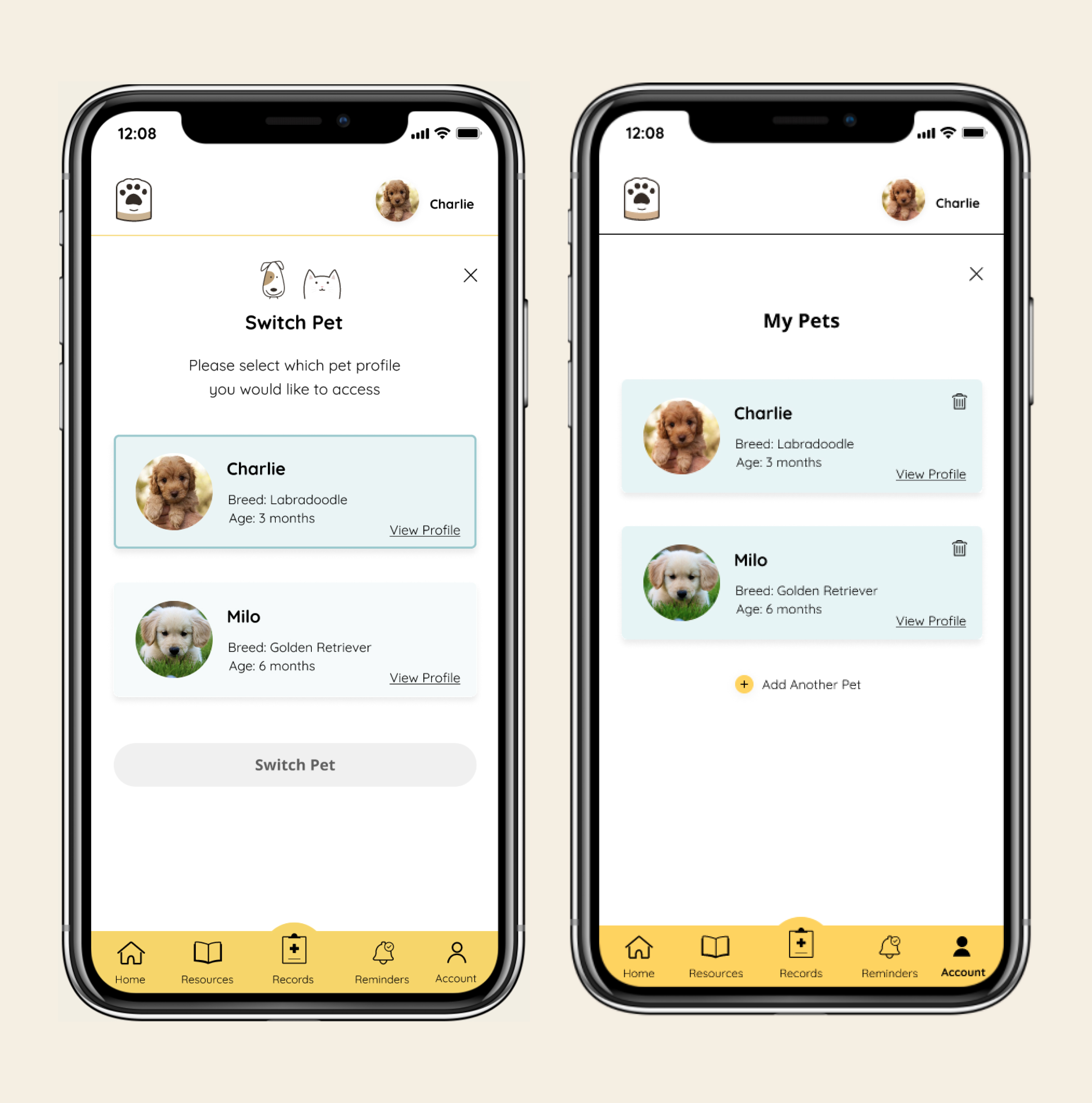
Difficulty navigating to add new pet/switch pets. Users felt the need for these two tasks to be separated
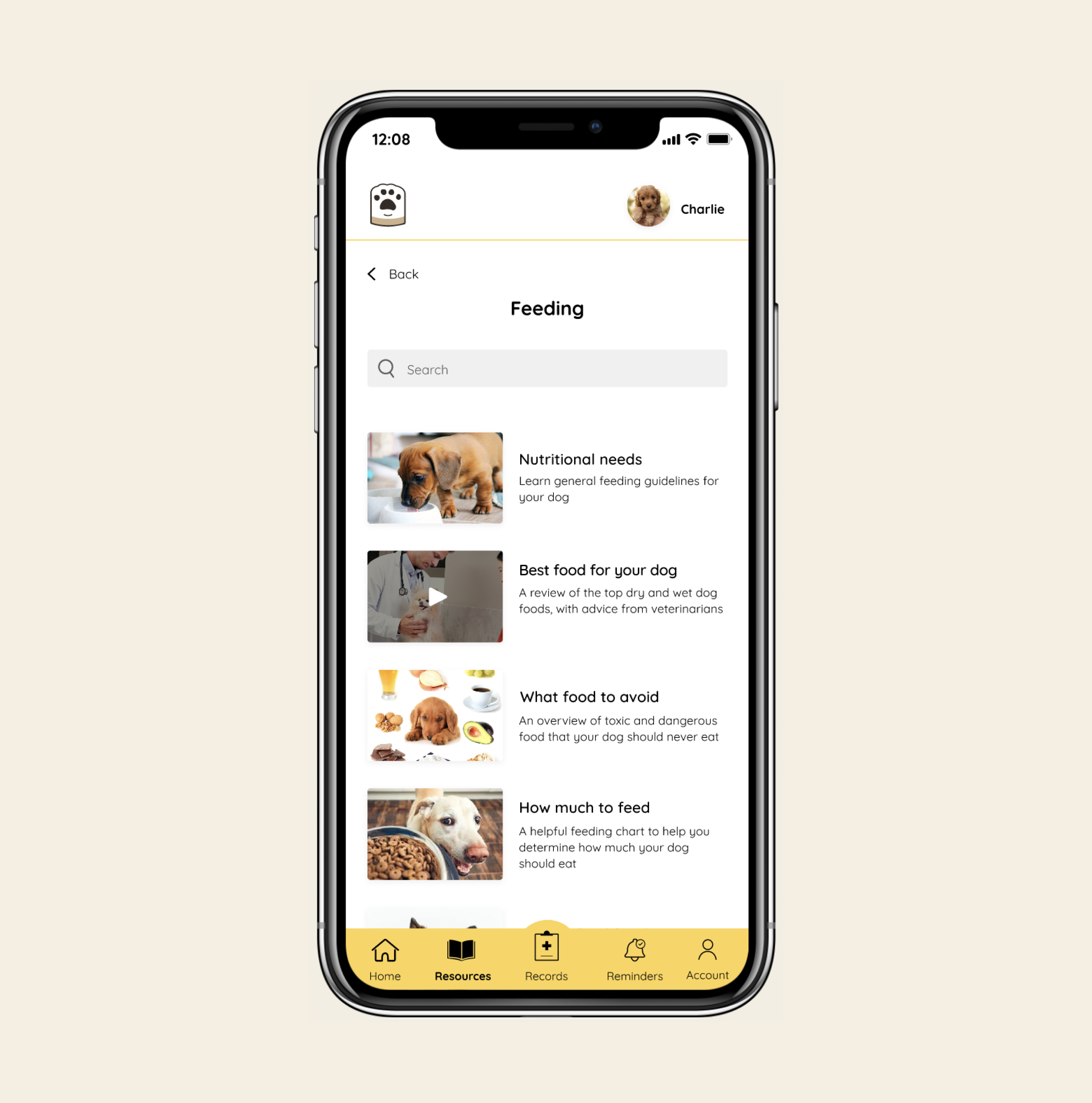
Lack of description in the resource section made it difficult to decide on which content to read
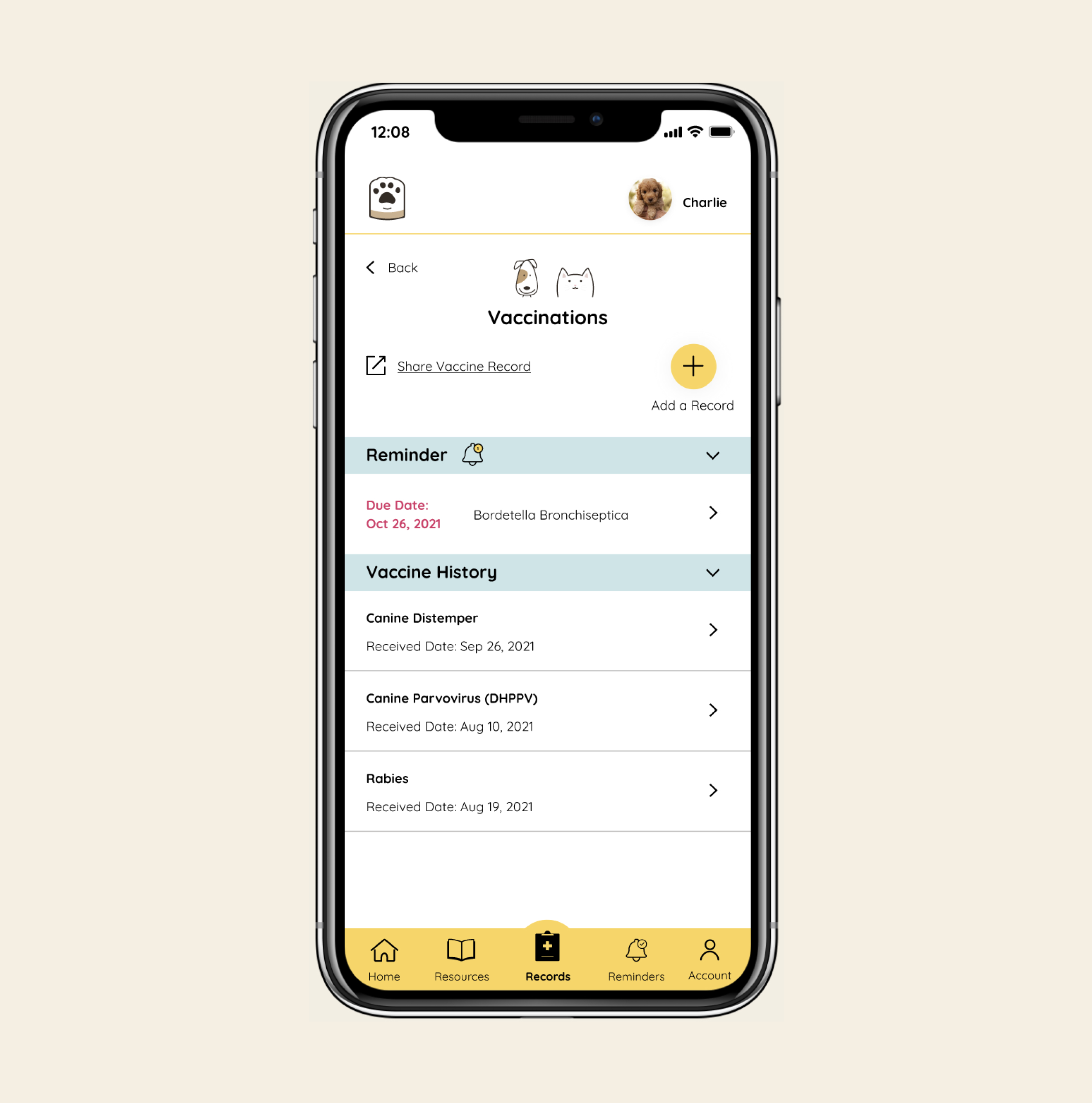
The Add icon was unclear to some users on the medical records section
Priority Revisions
Separated the 'Switch Pet' and 'Add New Pet' functions to align with user's expectations
"My intuition is to go into my account to add a new pet. I’d like to be able to easily switch my pet in the app - my instinct would be to click on the pet’s profile in the top right."
Added descriptions for each resource content to provide additional context to users
"The labels are great, but they're too broad. Some more description would help me decide whether or not I should read the content"
Added a label under the 'Add' icon to provide greater clarity on the key function
"It was not immediately clear to me at first what I can do with the Add icon"
Since I don't personally own any pets, speaking directly with pet owners allowed me to gain an understanding of the key pain points that they experience and guide the direction of my project. As a result, I expanded my project scope to focus not only on medical records (original idea), but also to include the ability to access pet care resources - a common pain point identified by pet owners during the discovery phase.
Next Steps
Given more time, I would..
Work with a developer to build this app, then gather user feedback and survey data to determine if this mobile app successfully solves user's pain points
Interview veterinarians to determine their POV and pain points to explore the idea of a potential integration with veterinary clinics to automate the input of medical records