Surrey Victoria Park Pharmacy (SVPP) is a newly opened independent pharmacy in North York, Toronto. The pharmacy has been successful so far in acquiring new customers as they are conveniently situated within a medical building. Currently, 70% of SVPP’s existing customers are 65 and older with a 90% customer retention rate. The pharmacy would like to develop an online website to reach new customers from the millennial demographic.
Challenge
The pharmacy finds it difficult to reach a younger demographic through their existing word-of-mouth referrals.
“How might we help a newly opened independent pharmacy reach the millennial demographic and acquire new customers?”
Solution
I created a responsive website with updated copywriting and information architecture to guide users to find what they need and encourage them to contact the pharmacy. Users can navigate the website to request for prescriptions, appointments and learn more about health-related topics generated by the pharmacy. Since we are aiming to acquire new customers, I focused on building trust through inclusive and accessible design.
Success Metrics
Increase number of online requests submitted (contact form, prescription, appointment requests)
Increase number of new customers acquired
Increase average click through rate
Process Overview
This project began with a kickoff meeting with the client to understand the goals for the website, the target audience, and align on scope, timelines and budget. Since the client did not have any existing user data, I used an exploratory research process and the design thinking framework to understand the problem space and the target audience's needs and pain points. Below are the 6 phases guiding my end-to-end design process.
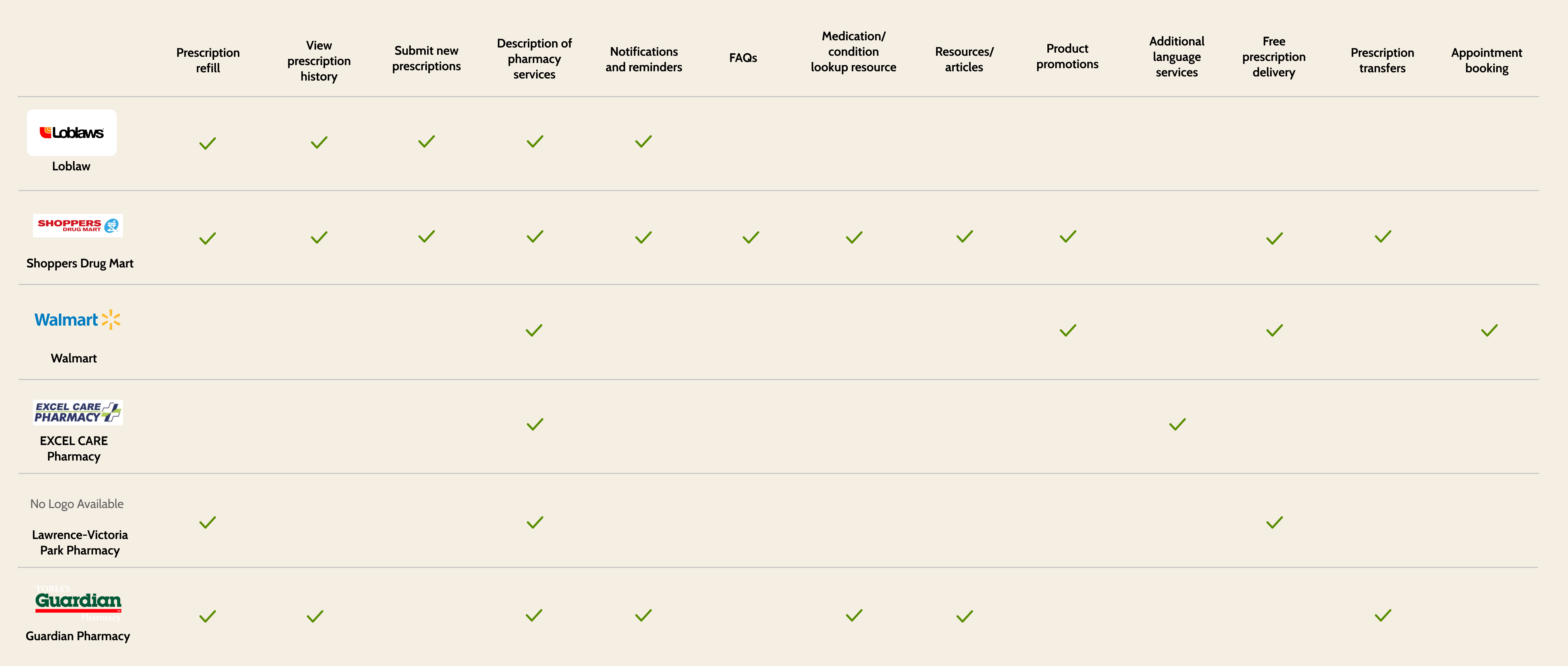
Many corporate pharmacy chains offer online prescription submissions and renewals, notifications, and health care resources through their websites. However, online prescription transfers, appointment booking, and prescription delivery services are inconsistent across pharmacy chains
Most independently owned pharmacies do not have a website. Those that do, have limited features and content
Research - Understanding the user experience
User Interview Insights
Objective
To understand how people currently select and coordinate with pharmacies and identify their motivations, goals, needs and pain points
Participants
6 participants between ages 26 – 79 who have visited a pharmacy or used an online website to contact a pharmacy in the past year
PATIENT PERCEPTIONS
Majority of participants perceived pharmacists as knowledgeable health care providers
All participants select their pharmacies of choice based on proximity and convenience, and value efficiency and customer service the most
Majority of participants prefer to call their pharmacy. However, given the option, many would prefer to avoid having to call the pharmacy at all
"Every time I’m at a pharmacy, they are always understaffed, the phone is ringing off the hook and there’s a long line up. Even though I was third in line, the whole experience took me over an hour”
“Insurance coverage is always confusing. I’m always unsure about how much I need to pay for my medications”
“Coming from another country, I don’t know where to find reliable sources of information. I always reach out to my relatives for advice"
"Knowing when my prescription would be ready and receiving some kind of notification would allow me to manage my time better.”
DEFINE
Synthesizing research findings
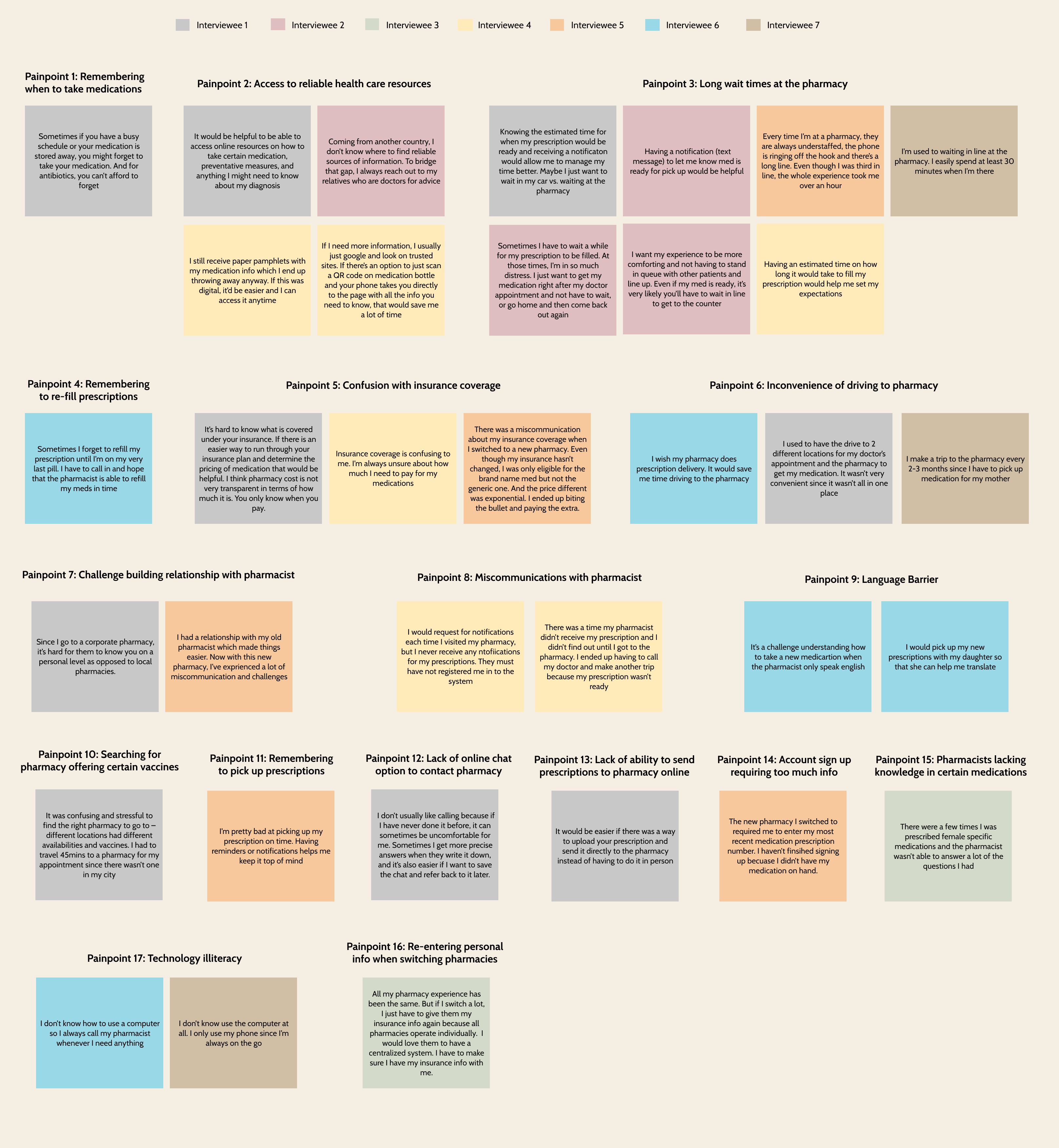
Affinity Map
Using data gathered from the user interviews, I created an affinity map to identify common themes and pain points and understand what users value most.
Common Pain points
Long wait times at the pharmacy
Confusion about insurance coverage for prescription medications
Difficulty accessing relevant and reliable healthcare resources
Inconvenience of medication pick up at the pharmacy
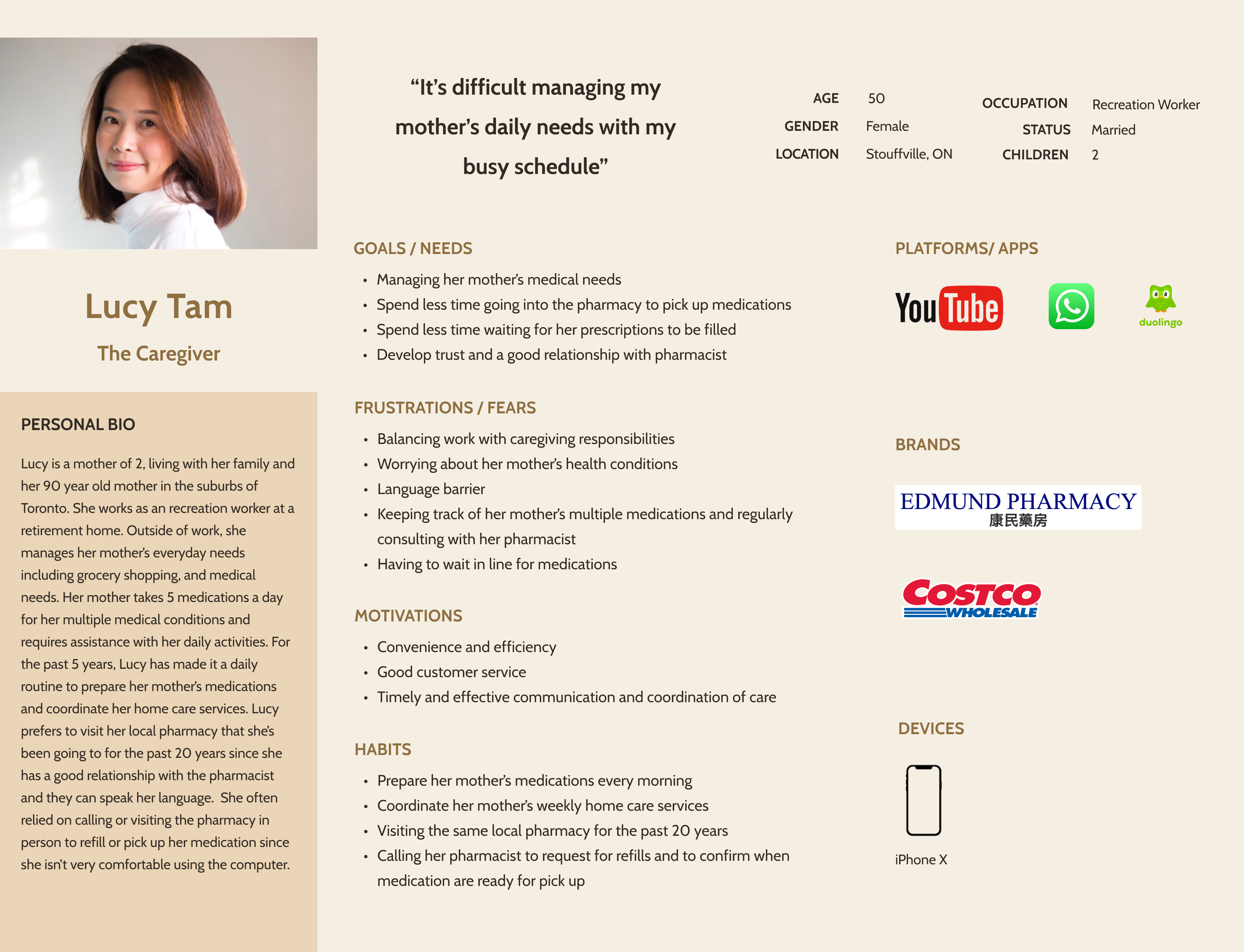
Defining the target customer
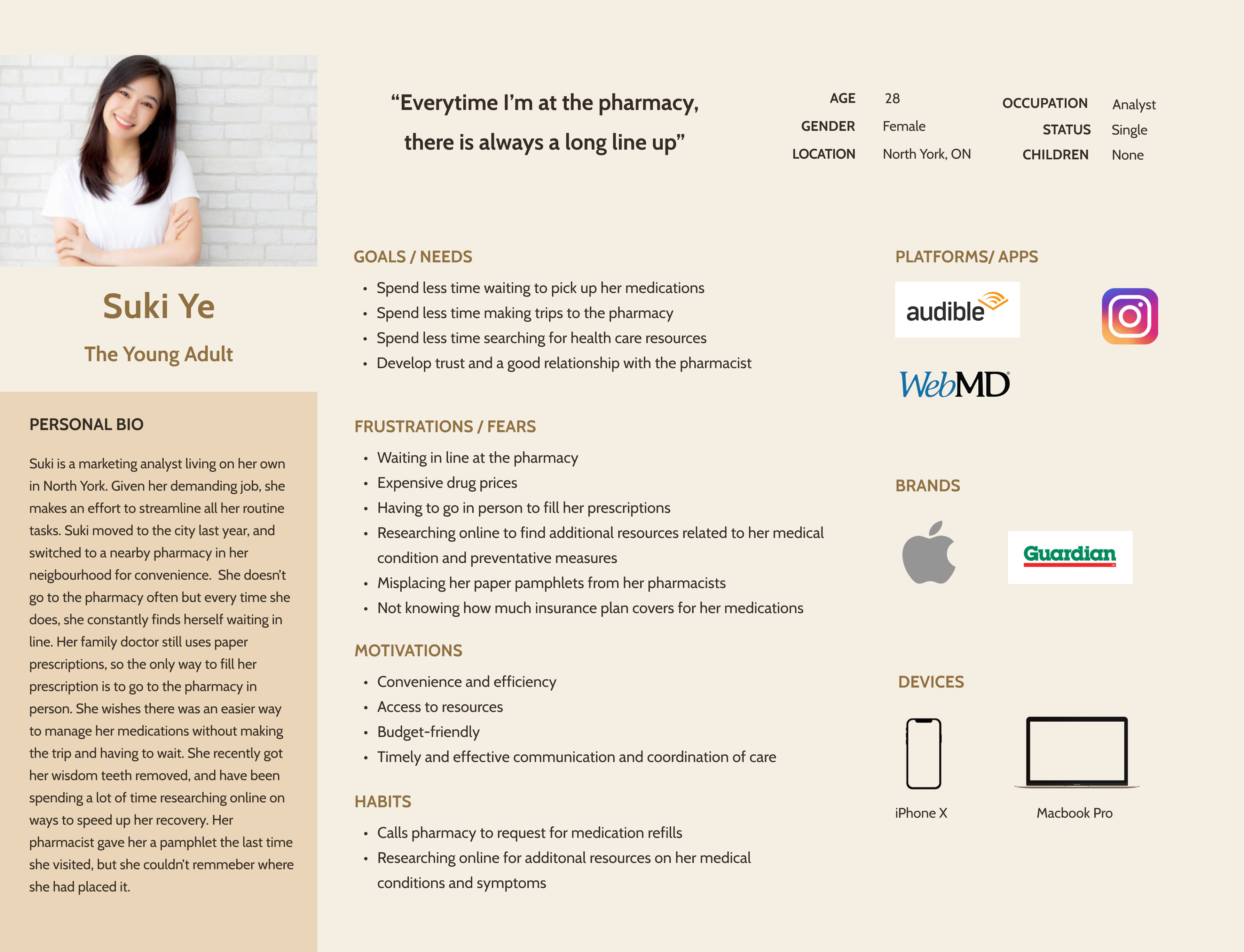
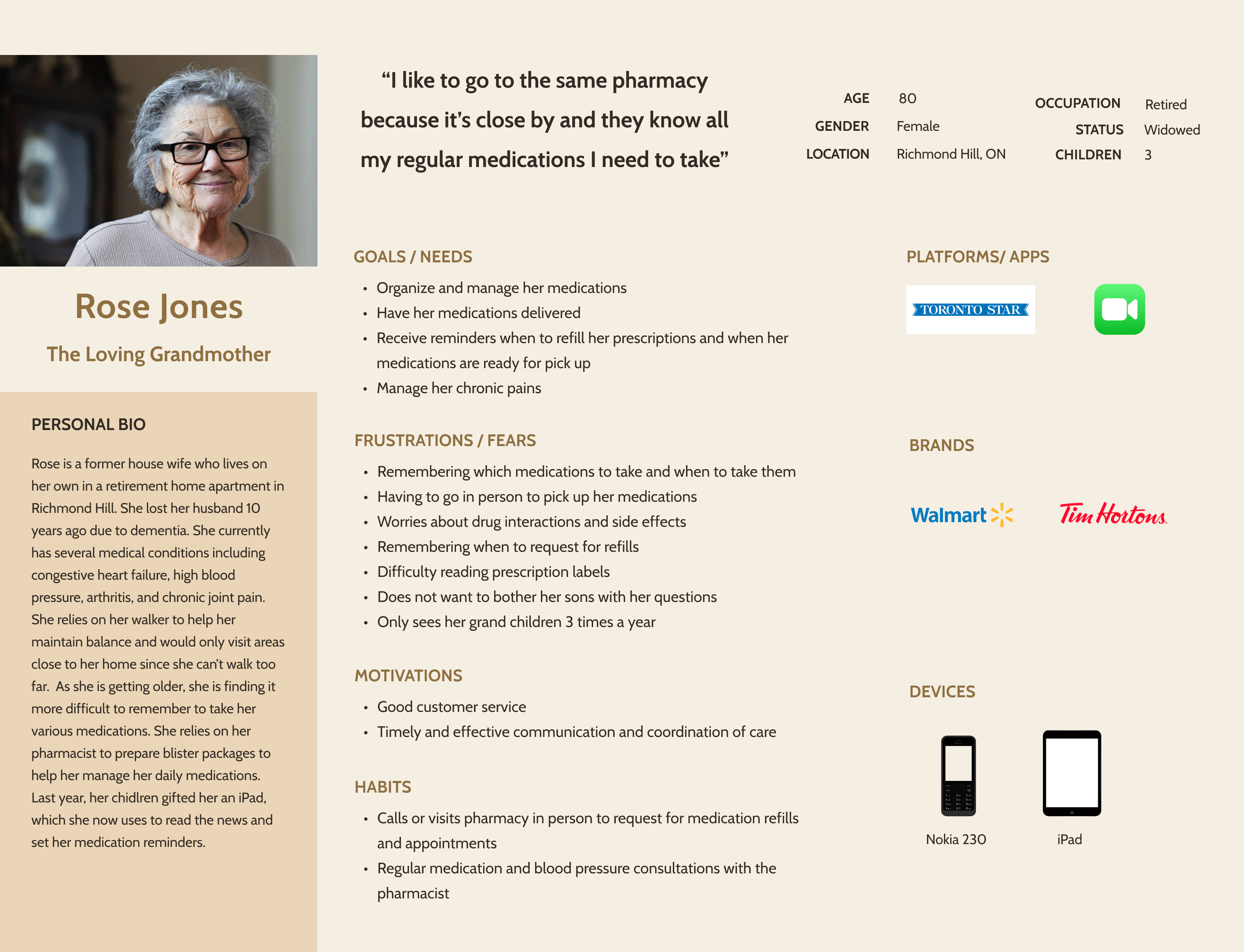
User Personas
I developed 3 personas based on my research insights - each serving a different demographic with varying goals, preferences and needs.
I focused on Suki as she is more likely to use an online pharmacy website to fulfill her pharmacy needs.
The user personas helped guide the ideation process to design a solution that supports the user's behaviour.
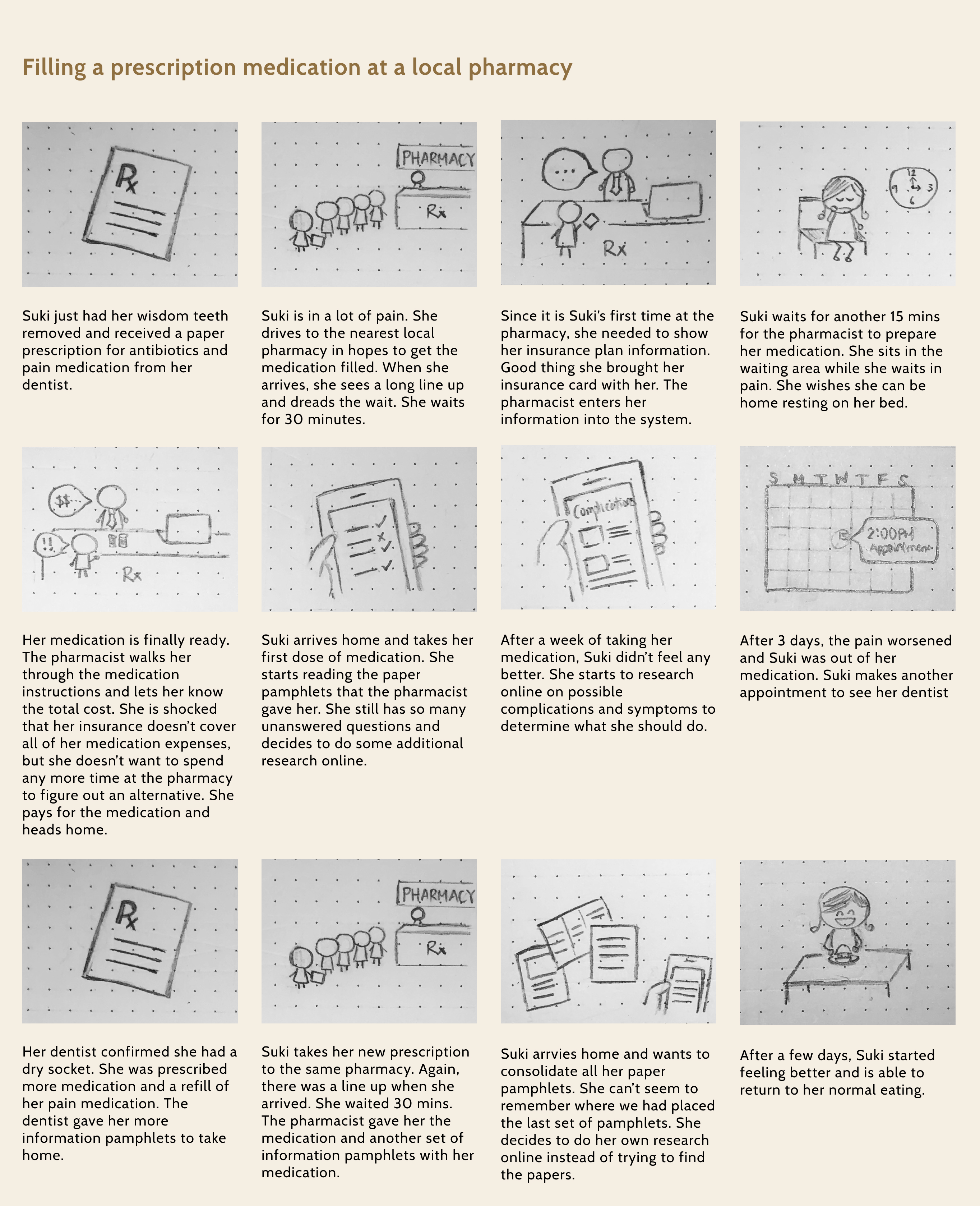
Understanding the customer journey
User Story Board
With an understanding of the target user’s needs and pain points, I created a story board to further understand Suki’s pharmacy experience by visualizing her interactions with the pharmacy, highlighting pain points and opportunities during specific parts of the customer journey. This provided insights into ways to improve efficiencies throughout the patient’s experience.
Sharing research insights with the client
Key Takeaways
Sharing research insights with the client helped narrow the project scope, and prioritize what we needed to focus on to achieve the business goal.
The user personas highlighted the value of focusing on the millennial user group, since they are more likely to use the pharmacy website.
TECHNICAL CONSTRAINTS IDENTIFIED
Lack of time, resource and budget for integration with pharmacy system
Lack of budget for integration with pharmaceutical companies to access medication/ healthcare resources
Lack of e-booking system to enable live update of appointment availabilities
Inability to support user account creation due to the need for additional approval by College of Pharmacy and time constraints
With these constraints in mind, I was able to align on expectations with the client and ensure that we developed a solution that was feasible to implement
Reframing research insights into opportunity areas
'How Might We' Statements
How might we create a process to help users easily contact the pharmacy?
How might we create a process to help users reduce wait times at the pharmacy?
How might we reduce the amount of time users spend researching for reliable and relevant health care resources online?
How might we help users easily request for appointments online?
How might we help users avoid multiple trips to the pharmacy?
Value proposition
Patient-centered
Accessibility
Integrity
Putting patients first by focusing on their needs
Removing barriers via free medication delivery and low drug costs
Making decisions in the best interest of patients
The solution
Design a pharmacy website to help SVPP acquire new customers from the millennial demographic, while enabling customers to easily access the pharmacy's services.
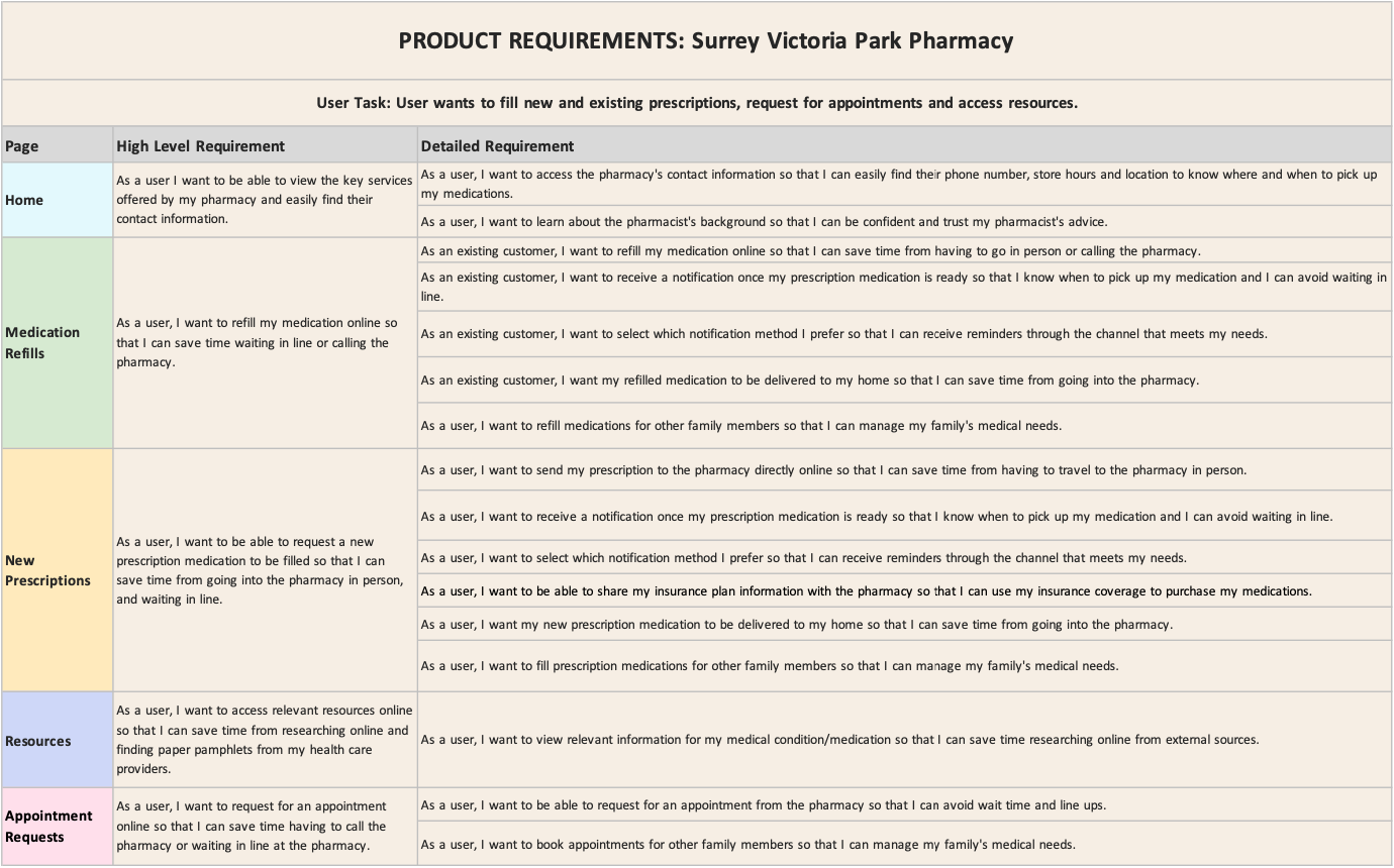
Defining the product roadmap
Product Requirements
With the research insights and a strong understanding of the user and business needs, I developed a set of product requirements with the client to guide the ideation phase.
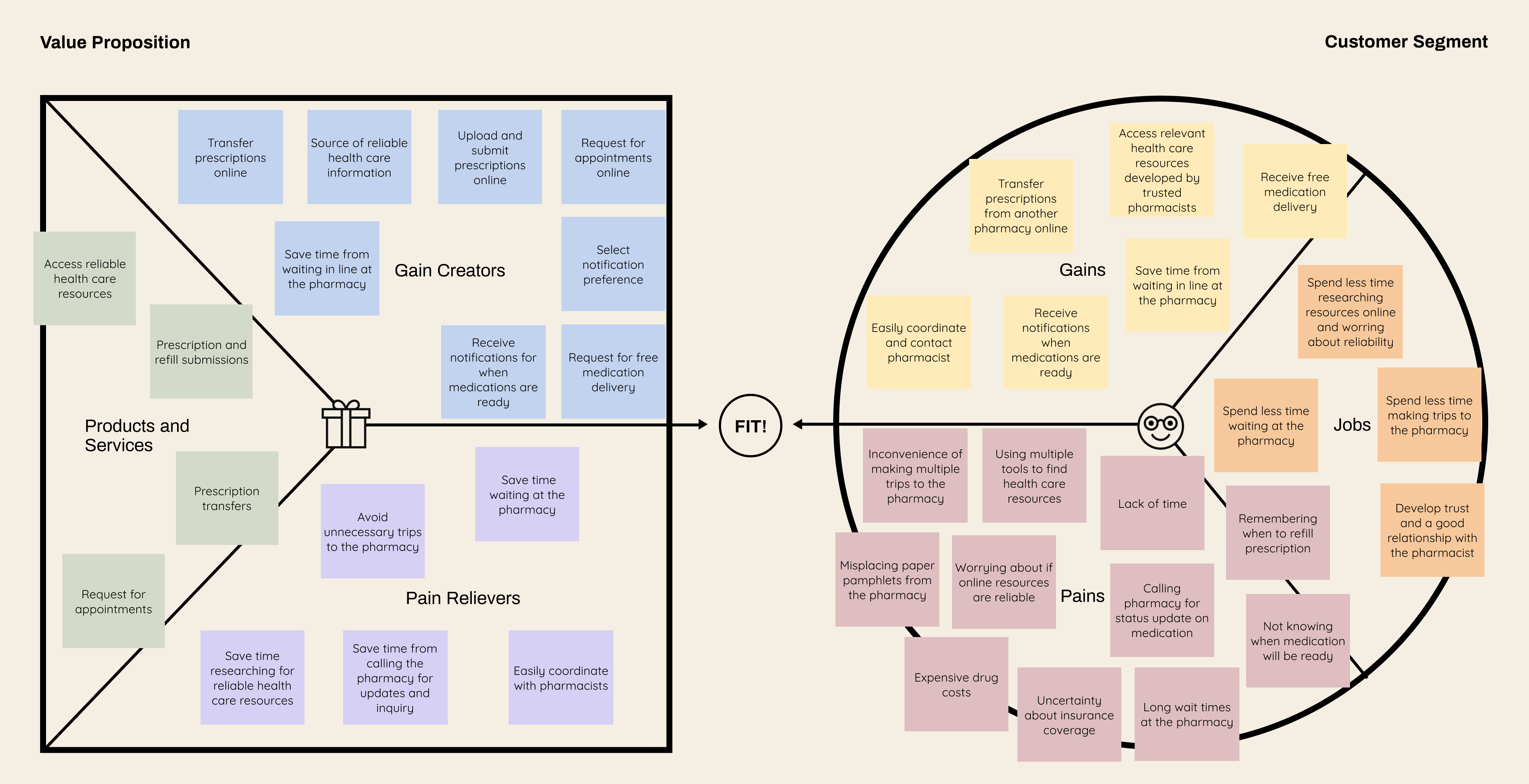
Aligning product and market fit
Value Proposition Canvas
From the research insights, I created a value proposition canvas to ensure that the user needs correspond to the value of the pharmacy's website
Understanding the current pharmacy processes
Identifying Functional Requirements
Based on the product requirements, I met with the client to gain a deeper understanding about the current pharmacy processes. This helped inform the specific data requirements for the website to enable effective and efficient online requests to the pharmacy.
Defining the foundations of the website
Site Map
Having a strong value proposition in place, and understanding of what users value most with their pharmacy experience, I began to define the foundations of the website.
I focused on keeping the layout simple, while including all the pertinent information readily accessible from the home page.
Understanding how users navigate the website
User Flows
Using the persona and story board as my reference, I created a user flow that mapped how Suki would navigate through the different pages of the website for a new pharmacy.
IDEATE
Building low fidelity wireframes
Sketches and Lo-fi wireframes
With the website layout and user flow in place, I created sketches and wireframes for the main pages of the website.
At this stage, I also included content writing to ensure that the content conveyed the intended brand message. I focused on creating easy to understand content that aligned with the brand message, while addressing the business and user needs.
PROTOTYPE & TEST
Wireframe prototype and testing
Low-fidelity Wireframe - Usability Testing
I walked through the wireframes with the client and also conducted an early round of usability testing in order to gather feedback from users and identify pain points early on. 3 users navigated through the low fidelity prototype via moderated tasks and overall, responded positively to the content and design.
"I like that the phone number is readily available so I don’t have to dig for it. From my experience, email sometimes takes forever so I like to call when I need to have things done immediately.'
"For medical related forms, it can get really lengthy. I think you’ve included the right amount of information. I like that you break up the questions into sections so that it feels less overwhelming"
"I like that you have a progress bar in the prescription form to let me know how far I have to go. It makes it easy to follow through with the steps"
Key PAIN POINTS IDENTIFIED
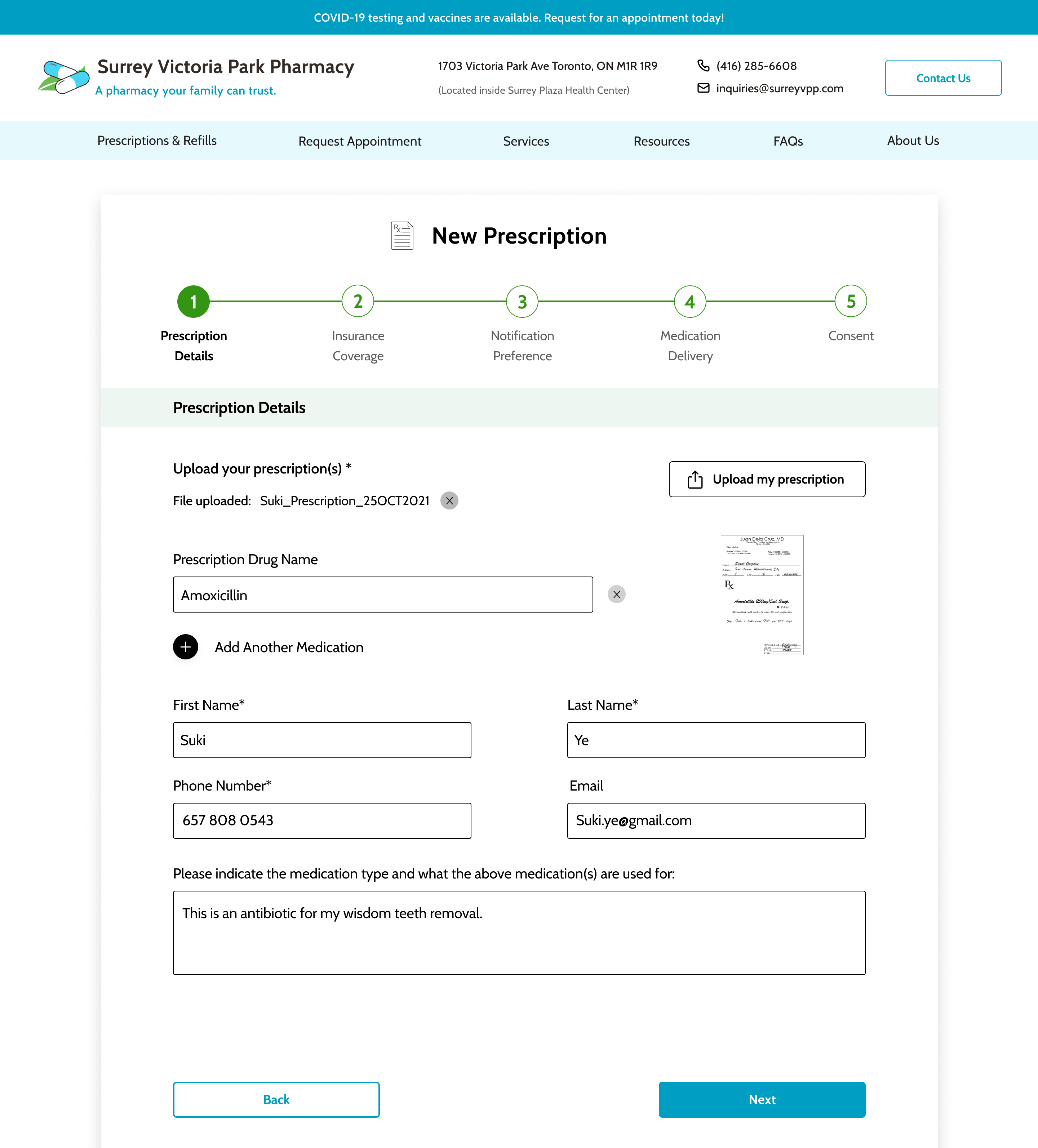
Users prefer to see a preview of their uploaded prescriptions to verify that they've uploaded the correct attachment
Challenges navigating to prescription and appointment requests as it was not readily accessible from the navigation
Users were more interested in seeing pharmacy services than guiding principles on the home page
Redundant 'Contact Us' CTAs on the landing page
Overwhelming amount of content on the services page
Developing brand identity
Logo Design
The client wanted the website to convey:
A sense of trust and transparency
Accessible care and access to medication
Caring and approachable professionals that patients can rely on for quality services
Keeping in mind the client’s vision for the website, I developed a few potential logo designs that supported the pharmacy's brand message. We decided on a simple visual of two pills sitting on top of an elegant leaf. The pills correspond to the pharmacy's key prescription service, while the leaf symbolizes health and healing.
UI Kit
I selected Cabin as the primary typeface due to its functional modern font, that is highly readable and welcoming. In terms of colour, the client had requested to avoid deviating too much from their original light blue brand colour since the pharmacy had already printed their store front signs. With that in mind, I selected a slightly darker shade of blue as the primary colour to convey trust and professionalism. Blue is calm and approachable, which makes users feel comfortable navigating through the website. Green was used as the accent colour to symbolize positivity and health. Thinking about accessibility – clear labelling and navigation was taken into consideration to enable users to easily navigate between the different pages and find what they need.
Based on the early feedback, I iterated on the wireframes and developed a high fidelity prototype for a second round of user testing to obtain further feedback. I incorporated the UI Kit to create high fidelity prototypes for both desktop and mobile
KEY CHANGES MADE
Added a prescription preview feature in the prescription request form to allow for verification of uploaded documents
Added Prescription/Refills and Request Appointment to the top navigation to improve accessibility to the essential services
Re-ordered the sections on the homepage and navigation to prioritize content that are more valuable to customers
Updated CTA on hero section of the home page to direct to user to Fill Prescription to avoid redundancy
Reduced the card size on the services page and incorporated a summary of key services at the top of the page to provide an at a glance view
TEST & ITERATE
Usability Testing
High Fidelity Prototype
4 users navigated through the high fidelity prototype via moderated tasks. Overall, users found the website conveyed trust, the colour choices and imagery were friendly and welcoming, and the website content was clear and easy to navigate. Users appreciated having the contact info readily accessible as it is the commonly what users look for when searching for a pharmacy
"The copy is written very patient-centered and makes me feel taken care of"
"I like how you elaborated on how to get to the pharmacy because that’s something that Google Map doesn’t tell you"
"For something as sensitive as prescriptions, it felt easy, trusting and reputable"
Key PAIN POINTS IDENTIFIED
Lack of ability to review prescription requests prior to submitting
Concerned about land lines being used for text notifications
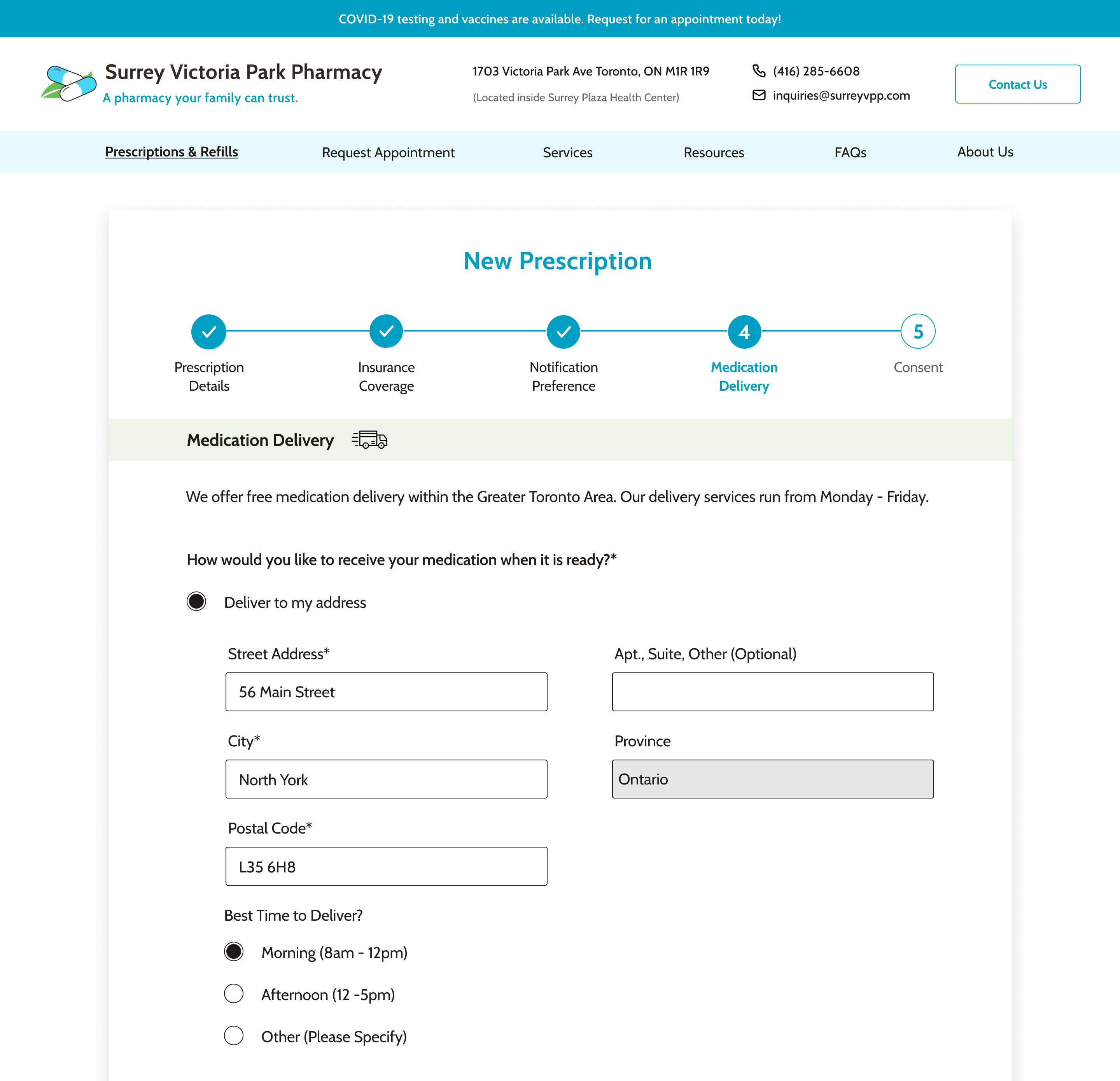
Expectation to select medication delivery time preference using radio button instead of free text
Priority Revisions
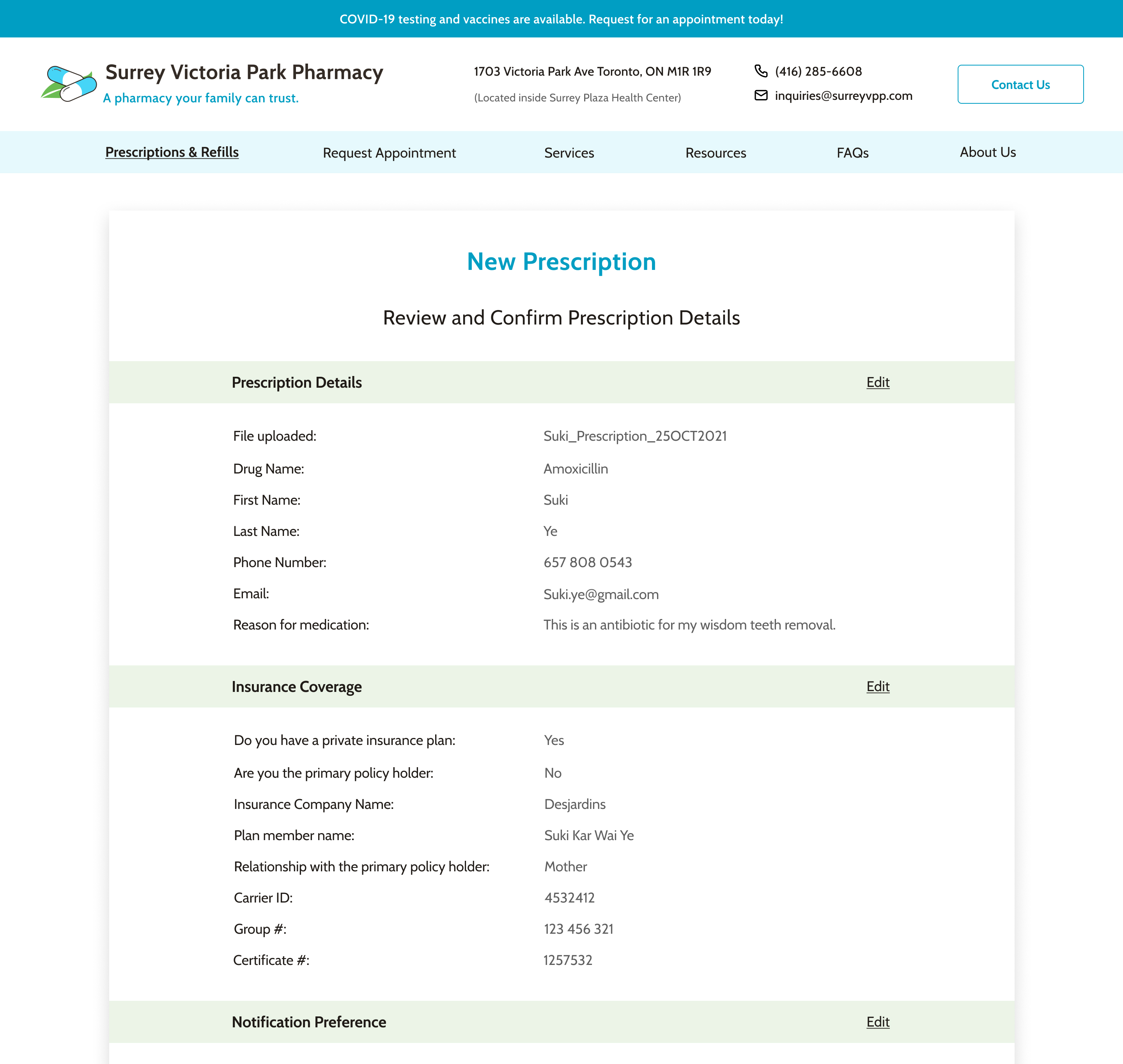
Incorporated a review page to allow users to review accuracy of information prior to submitting a prescription
"I would like to be able to look over my information entered before submitting my prescription request"
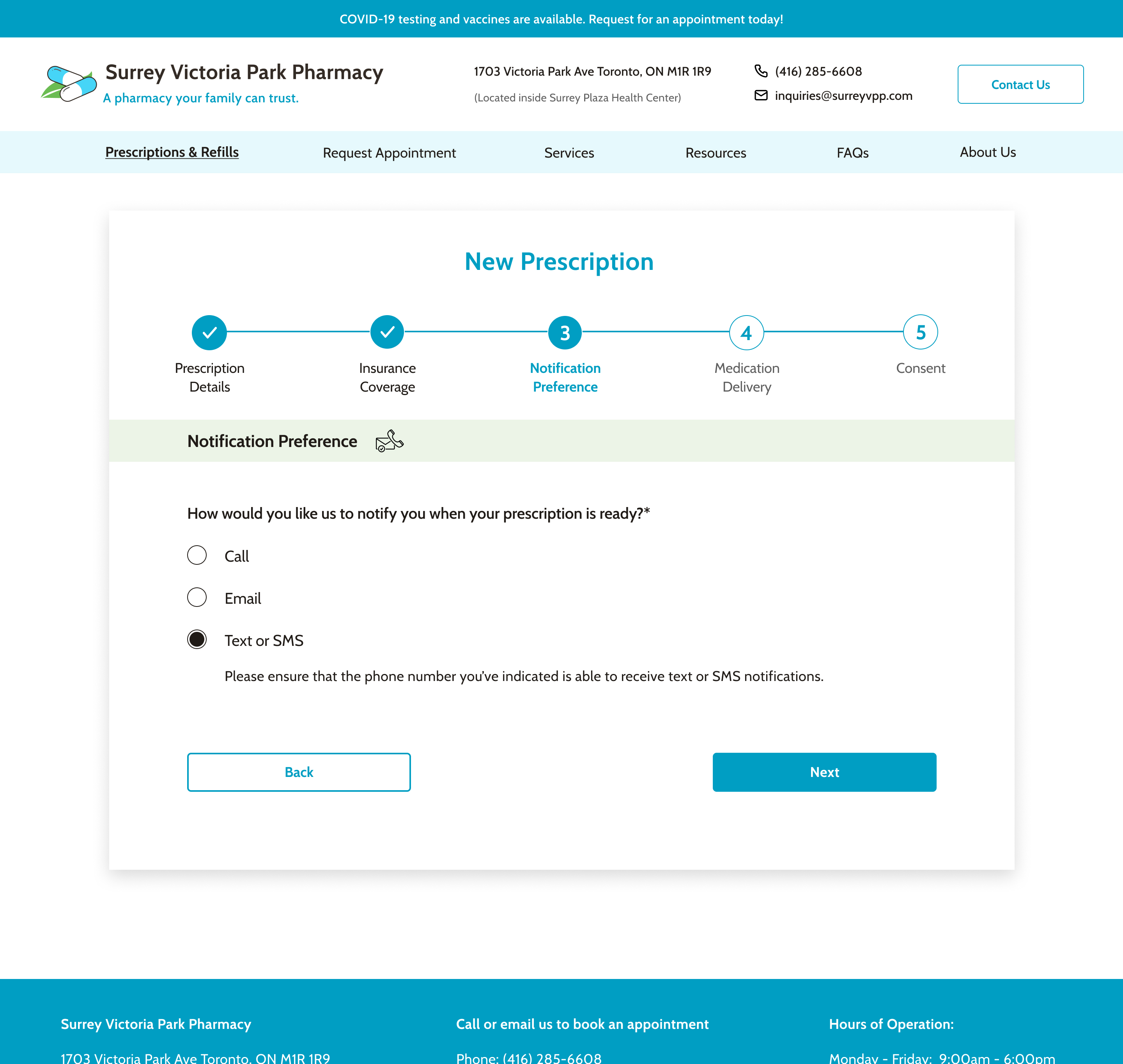
Added a warning message to remind users to enter in a cell phone number
"Most people have cell phones these days, but if someone entered a landline, they may not get a text notification."
Incorporated a radio button selection to indicate time preference in the medication delivery section of the prescription form
"I wouldn’t know what to write in the notes section. If there’s an option to ask me for my time preference in a form of radio button, that would be easier"
I learned that starting the process with understanding the client’s needs was essential to guiding the design solution. Sharing research findings early on helped the client better understand their user’s needs and be open to considering alternative design solutions. By meeting with the client twice a week helped ensure that we were aligned in terms of the product strategy, expectations, and next steps.

.png)